Catalog visualization
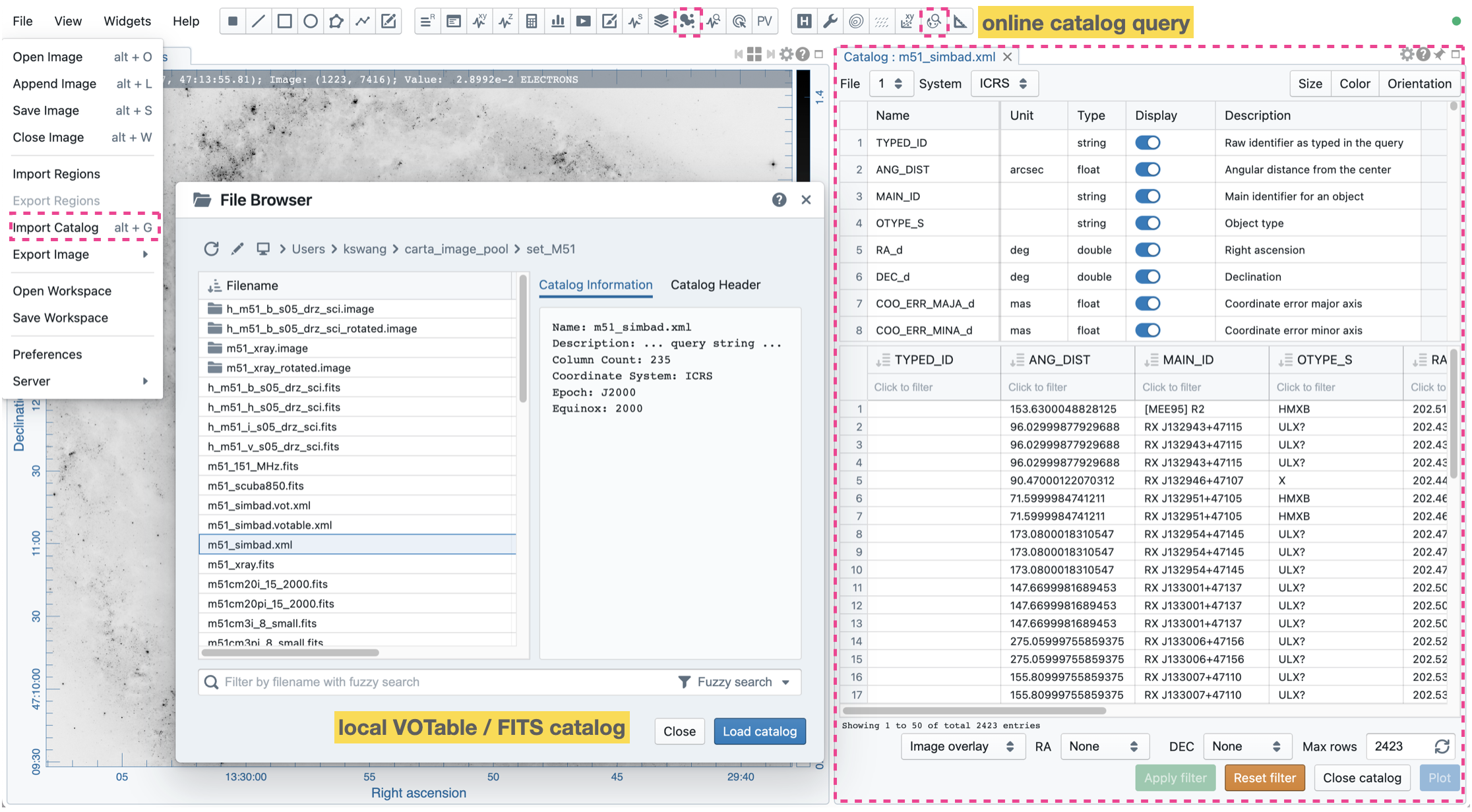
Source catalog files in VOTable or FITS format can be loaded in CARTA (via “File” -> “Import Catalog”) for visualization as an image overlay, a 2D scatter plot, or a histogram. Once a source catalog file is loaded, the information of each column will be shown in the upper table, while the actual catalog entries are displayed in the lower table. By default, only the first ten columns of an offline catalog file are enabled and displayed (use “File” -> “Preferences” -> “Catalog” to change the default number). With the upper table, you may configure it to show or hide specific columns to be displayed in the lower table.
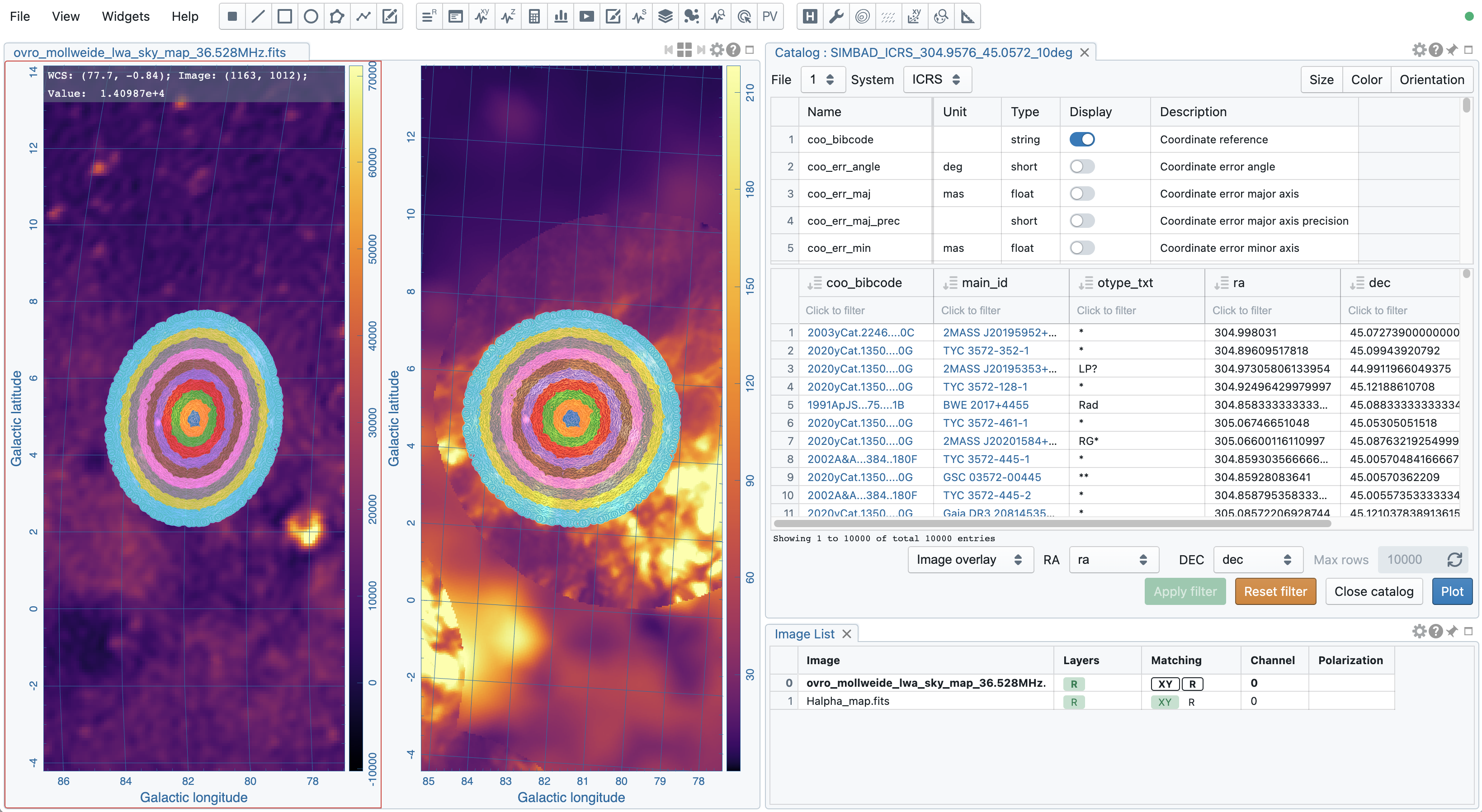
When the rendering type is “Image overlay”, a coordinate system of the source catalog needs to be defined via the “System” dropdown menu. CARTA tries to obtain the coordinate system information from the header of the catalog file. If this process is unsuccessful, you must set it manually to interpret the world coordinates correctly. The source catalog defined in the image coordinate (0-based or 1-based) is also supported.
Multiple catalog files can be loaded, and you may use the “File” dropdown menu at the top of the widget to switch catalog files. Multiple Catalog Widgets may be launched to display different catalog files. The “Close catalog” button at the bottom of the widget will close the selected catalog file in the “File” dropdown menu. If there are spatially matched images, the catalog overlay on the reference image will be shared with other images with proper coordinate transformations.
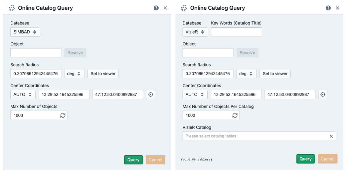
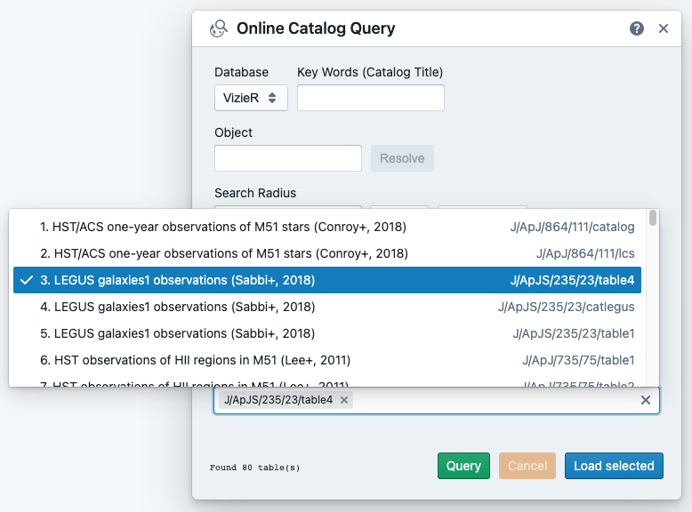
Alternatively, you can use the Online Catalog Query Dialog from the dialog bar to search for catalogs from “SIMBAD” (http://simbad.u-strasbg.fr) or “VizieR” (https://vizier.u-strasbg.fr/viz-bin/VizieR) service and retrieve catalogs for visualization.
Catalog filtering
The source catalog table accepts sub-filters such as partial string match or value range. For numeric columns, supported operators are:
>: greater than>=: greater than or equal to<: less than<=: less than or equal to==: equal to!=: not equal to..: between (exclusive)...: between (inclusive)
For examples:
To filter everything less than 10, use
< 10To filter entries equal to 1.23, use
== 1.23To filter everything between 10 and 50 (exclusive), use
10..50To filter everything between 10 and 50 (inclusive), use
10...50
For string columns, a partial match is adopted. For example, gal (no quotation) will return entries containing the “gal” string.
The filters will be applied by clicking the “Apply filter” button or pressing the “enter” or “return” key. The filtered source catalog will be displayed up to the number of entries defined in the “Max Rows input field. Clicking the “Reset filter” button removes all filters and the image overlay (if present). The plot will be reset for the histogram plot or the 2D scatter plot, and only the first (up to) 50 entries will be rendered.
Catalog image overlay
CARTA supports flexible catalog image overlay rendering with variable marker size, color, and orientation. A catalog image overlay can be generated using the dropdown menus at the bottom of the Catalog Widget. When the rendering type is “image overlay”, two data columns need to be identified as the world coordinates. Once configured correctly, you can click the “Plot” button to generate a catalog overlay on the image.
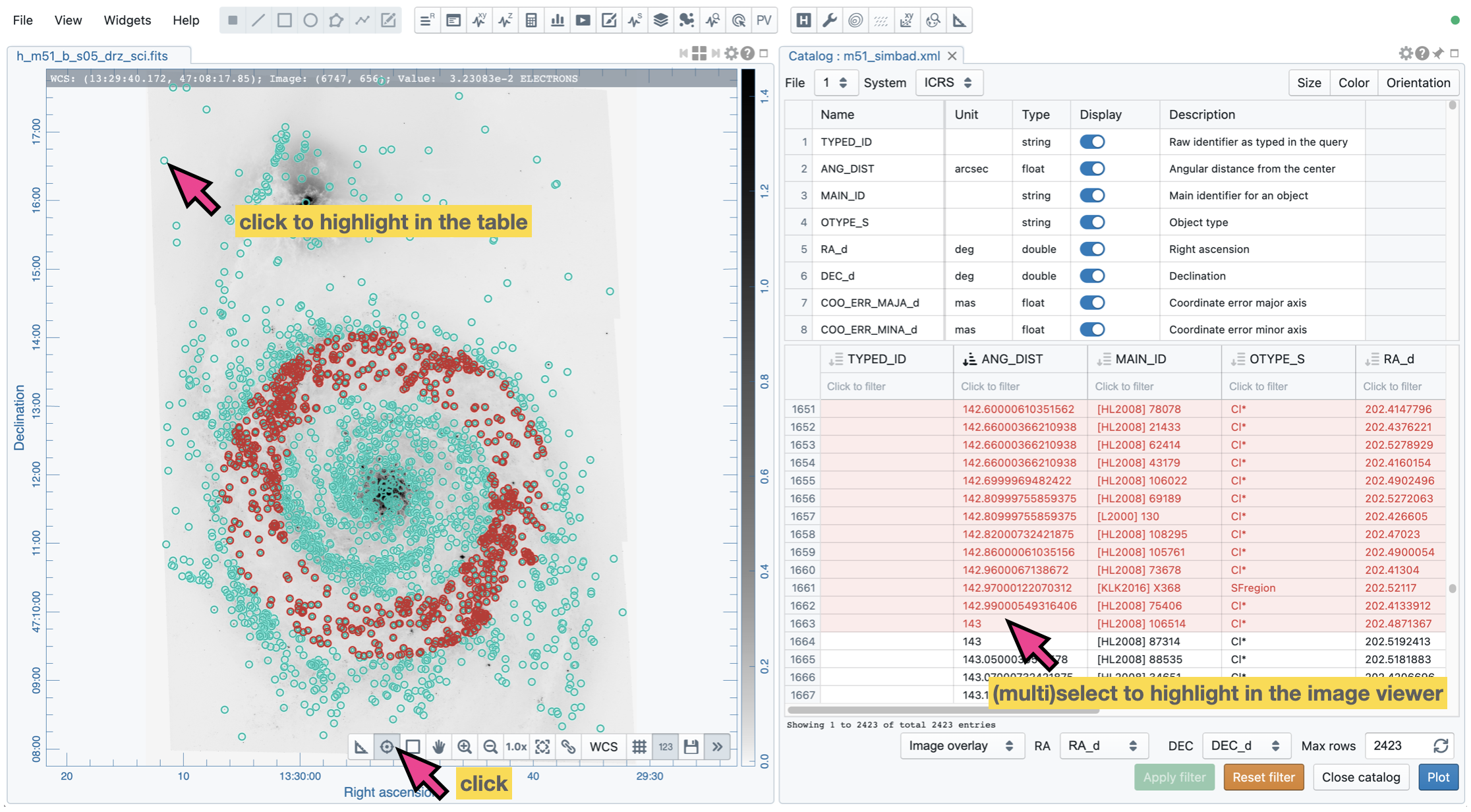
A catalog is loaded and displayed in the Catalog Widget in the example below. The rendering type is “Image Overlay”, and the “RA_d” and the “DEC_d” columns are identified as source world coordinates in the ICRS system. A filter is applied to the “ANG_DIST” column, resulting in 638 filtered sources. These sources are rendered on the image as cyan circles.
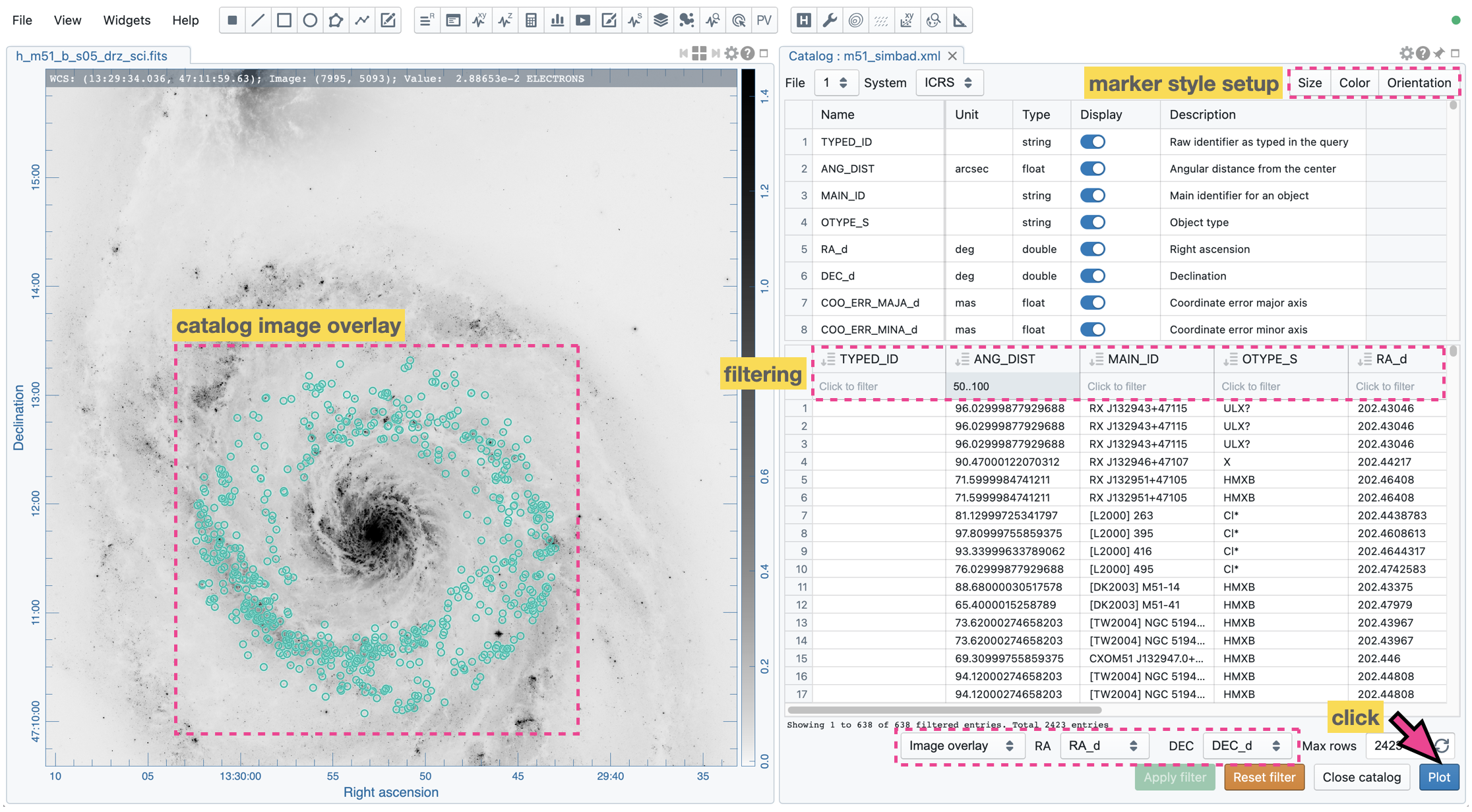
The marker’s size, color, and orientation properties can be adjusted via the Catalog Settings Dialog. The shortcut buttons are available at the top-right corner of the widget.
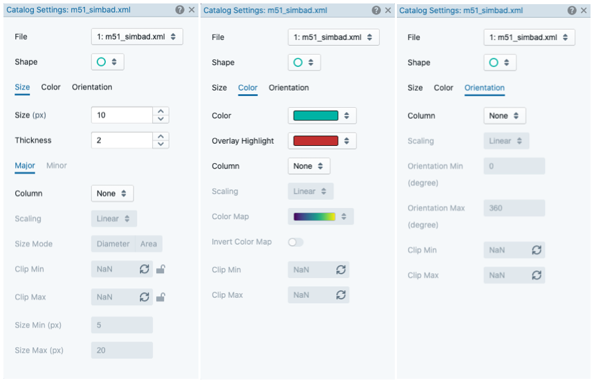
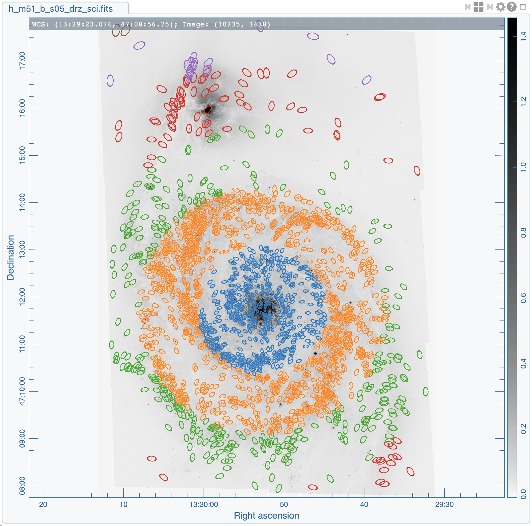
With the “Size”, “Color”, and “Orientation” tabs, you can create a catalog overlay with a uniform color, a uniform size, and a uniform orientation. Alternatively, each maker property can be mapped to a data column with a scaling function and clip bounds so that the marker property becomes variable. The following example uses an ellipse marker to generate the catalog overlay. Its color, size, and orientation are mapped to data columns.
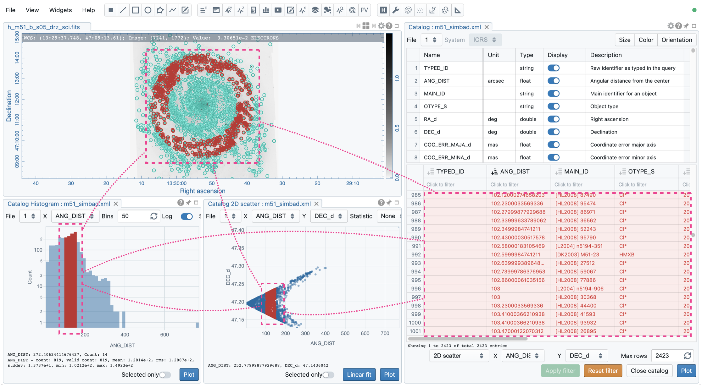
The catalog overlay and the catalog table in the Catalog Widget are interlinked. For example, when you select a source on the image, the selected source will be highlighted in the image and the catalog table, and vice versa.
Catalog 2D Scatter Plot
The Catalog 2D Scatter Plot Widget shows a 2D scatter plot of two numeric columns of a catalog file. The available numeric columns are determined by the “Display” column of the upper table in the Catalog Widget. The lower table in the Catalog Widget determines the data used for plotting the 2D scatter. The table may not show all entries due to the dynamic loading feature. Thus, the 2D scatter plot may not include all entries (after filtering). The “Plot” button in the Catalog 2D Scatter Plot Widget will request a full download of all entries, and the scatter plot will then include all entries (after filtering).
By clicking on a point or using the selection tools from the top-right corner of the scatter plot, selected sources will be highlighted in the source catalog table, in the histogram plot (if it exists), and in the Image Viewer (if the catalog overlay is enabled). Points on the plot will be highlighted if sources are selected in the source catalog table, in the histogram plot (if it exists), and in the Image Viewer (if the catalog overlay is enabled). With the “Selected only” toggle, you can update the source catalog table to show only the selected sources. You can use the “Statistic source” dropdown menu to select a data column to show its basic statistics at the bottom of the scatter plot.
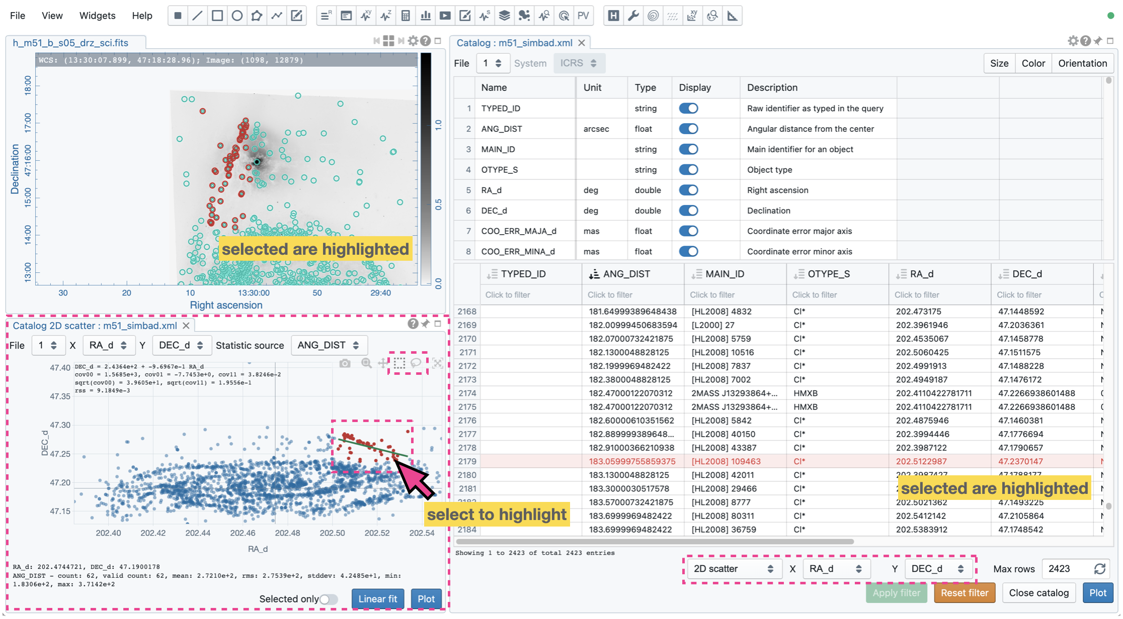
The “Linear Fit” button allow you to fit a straight line to the data points in the current view. Data points outside the current view are not included in the linear fit process. The fitting results are summarized at the top-left corner of the scatter plot.
Catalog Histogram Plot
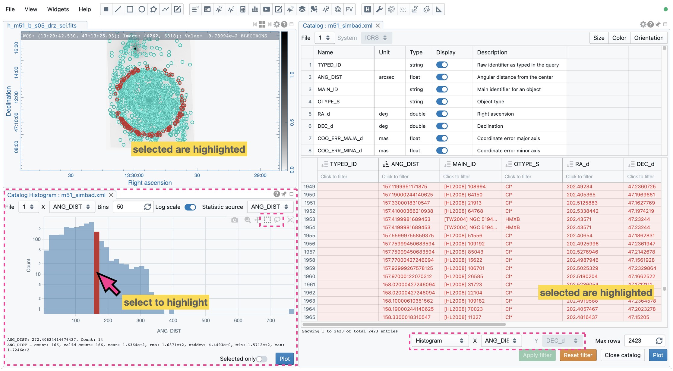
The Catalog Histogram Plot Widget shows a histogram of one numeric column of a catalog file. The available numeric columns are determined by the “Display” column of the upper table in the Catalog Widget. The lower table in the Catalog Widget determines the data used for plotting a histogram. The table may not show all entries due to the dynamic loading feature. Thus, the histogram plot may not include all entries (after filtering). The “Plot” button will request a full download of all entries, and the histogram plot will include all entries (after filtering). The number of bins and the y-axis scale can be customized with the “Bins” field and the “Log scale” toggle, respectively.
By clicking on a specific histogram bin, source entries of that bin will be highlighted in the source catalog table, in the 2D scatter plot (if it exists), and in the Image Viewer (if the catalog overlay is enabled). A specific histogram bin will be highlighted if source entries of that bin are selected in the source catalog table, in the 2D scatter plot (if it exists), and in the Image Viewer (if the catalog overlay is enabled). With the “Selected only” toggle, you can update the source catalog table to show only the selected sources. You can use the “Statistic source” dropdown menu to select a data column to show its basic statistics at the bottom of the histogram plot.
Linked catalog visualization
The source catalog table, the image overlay, the 2D scatter plot, and the histogram plot are interlinked or cross-referenced. For example, selecting a source or a set of sources in the catalog table will trigger source highlights elsewhere. Alternatively, selecting a source or a set of sources in the 2D scatter plot will trigger source highlights in other plots and the catalog table.