Image cube analysis tools
With version 3.0.0, CARTA provides the following widgets and tools for image cube analysis:
- Widget
- Region list: to view and configure region properties
- Spatial profiler: to view x or y spatial profile at the cursor position
- Spectral profiler: to view one or multiple spectral profiles
- PV genetator: to generate a position-velocity slice of a cube
- Histogram: to view histogram from a region of interest
- Statistics: to view basic statistics from a region of interest
- Stokes analysis: to view basic polarization quantities (e.g., polarized intensity and angle)
- Spectral line query: to make a query to the Splatalogue service and create labels on a spectral profile plot
- Cursor info: to view image pixel information from all matched images at the cursor position
- Catalog widget: to visualize a catalog as an image overlay, a 2D scatter plot, or a histogram
- Tool
- Profile smoothing: to smooth a spectral or spatial profile for a better S/N
- Moment map generator: to collapse an image cube with various moments and statistics
- Spectral profile fitting: to fit an observed spectrum with a model profile
- 2D image fitting: to fit an image with multiple 2D Gaussian models
- Distance measure: to compute a geodesic distance on the image
- Online catalog query: to retrive remote catalogs from SIMBAD or VizieR
Region of interest
As of v3.0.0, CARTA supports the following region types:
- rectangle (rotatable)
- ellipse (rotatable)
- square (rotatable; as a special case of rectangle; “shift” key + drag)
- circle (as a special case of ellipse; “shift” key + drag)
- point
- polygon
- line (rotatable)
- polyline
The creation and modification of regions are demonstrated in the section Mouse interactions with region of interest. To create a region, use the region button from the toolbar at the bottom-right corner of the image viewer or use the region buttons from the region bar at the top of the GUI, then use the cursor drag-and-drop action to draw a region. CARTA allows regions to be created even if the region is outside the image. Keyboard shortcuts associated with regions are listed below.
| macOS | Linux | |
|---|---|---|
| Region properties | double-click | double-click |
| Delete selected region | del / backspace | del / backspace |
| Toggle region creation mode | C | C |
| Deselect region | esc | esc |
| Cancel region creation | esc | esc |
| Switch region creation mode | cmd + drag | ctrl + drag |
| Symmetric region creation | shift + drag | shift + drag |
| Toggle current region lock | L | L |
| Unlock all regions | shift + L | shift + L |
| Pan image (inside region) | cmd + click / middle-click | ctrl + click / middle-click |
Tip
“backspace” does not delete a region…
If using CARTA remote mode in Firefox on macOS, you may find the “backspace” key navigates back a page instead of removing a region. This behaviour can be prevented by modifying your Firefox web browser settings:
- Enter about:config in the address bar.
- Click “I accept the risk!”
- A search bar appears at the top of a long list of preferences. Search for “browser.backspace_action”
- It will likely have a value of 0. Double click it, and then modify it to a value of “2”.
- Close the about:config tab and now backspace will no longer navigate back a page.
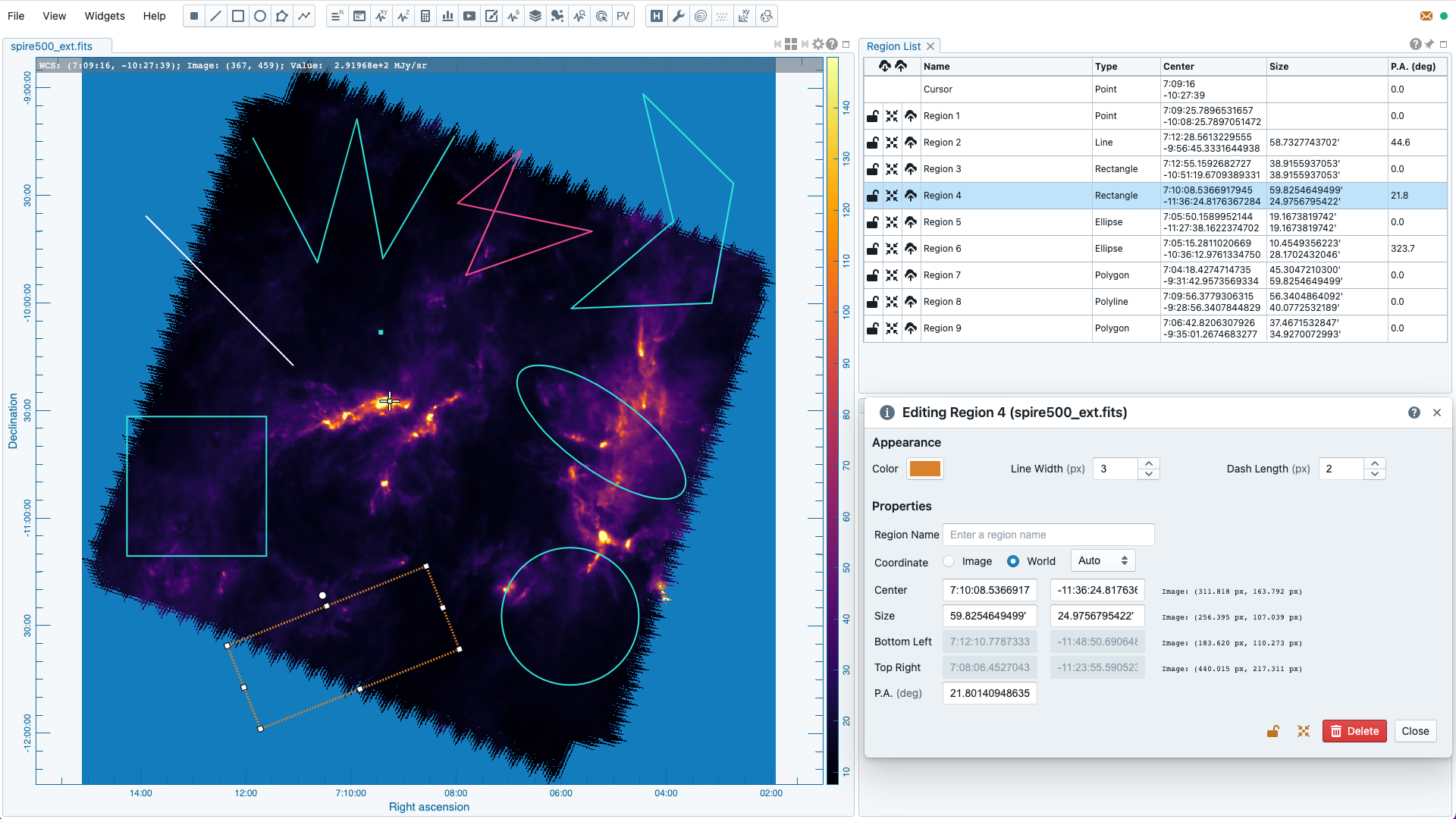
All created regions are listed in the region list widget with basic region properties. To select a region (region state changes to “active”), simply click on the region in the image viewer, or click on the region in the region list widget. To modify the properties of a selected region, double-click on a region in the image viewer or a region in the region list widget. The color, line style, name, location, and shape of a region are all configurable with the region configuration dialog. The location and shape properties can be edited in the image coordinates, or in the world coordinates with angular scales (default). To de-select a region or cancel a region creation process, press the “esc” key. To delete a selected region, press the “delete” or “backspace” key. An active region can be locked by pressing the “L” key or by clicking the “lock” button in the region list widget or region property dialog. When a region is locked, it cannot be modified (resize, move, or delete) with mouse actions and the “delete” or “backspace” key. A locked region, however, can still be modified or deleted via the region configuration dialog. Locking a region could help the situation when you want to modify overlapping regions, or could prevent modifying a region accidentally. The “focus” button is to show the corresponding region at the center of image view.
CARTA checks if a polygon is simple or complex. If a polygon is detected as complex (i.e., polygon line segments intersect), its color will become pink as a warning. Spectral profile, statistics, or histogram of a complex polygon can still be requested. However, the outcome may be beyond your expectations. The enclosed pixels depend on how a complex polygon is constructed. Please use complex polygons with caution.
When editing region properties in the world coordinates, the coordinate reference system can be changed with the dropdown menu. The default reference system is the one as defined in the image header and is the same as the one defining the grid line overlay in the image viewer. When you switch to a different reference frame, the grid line overlay in the image viewer is changed too. If the reference system is ICRS, FK5 or FK4, the coordinate is in sexagesmial format. If the reference system is Galactic or Ecliptic, the coordinate is in decimal degrees. The region size property can be defined in arcsecond with “, in arcminute with ‘, or in degrees with deg.
Shared region with conserved solid angle
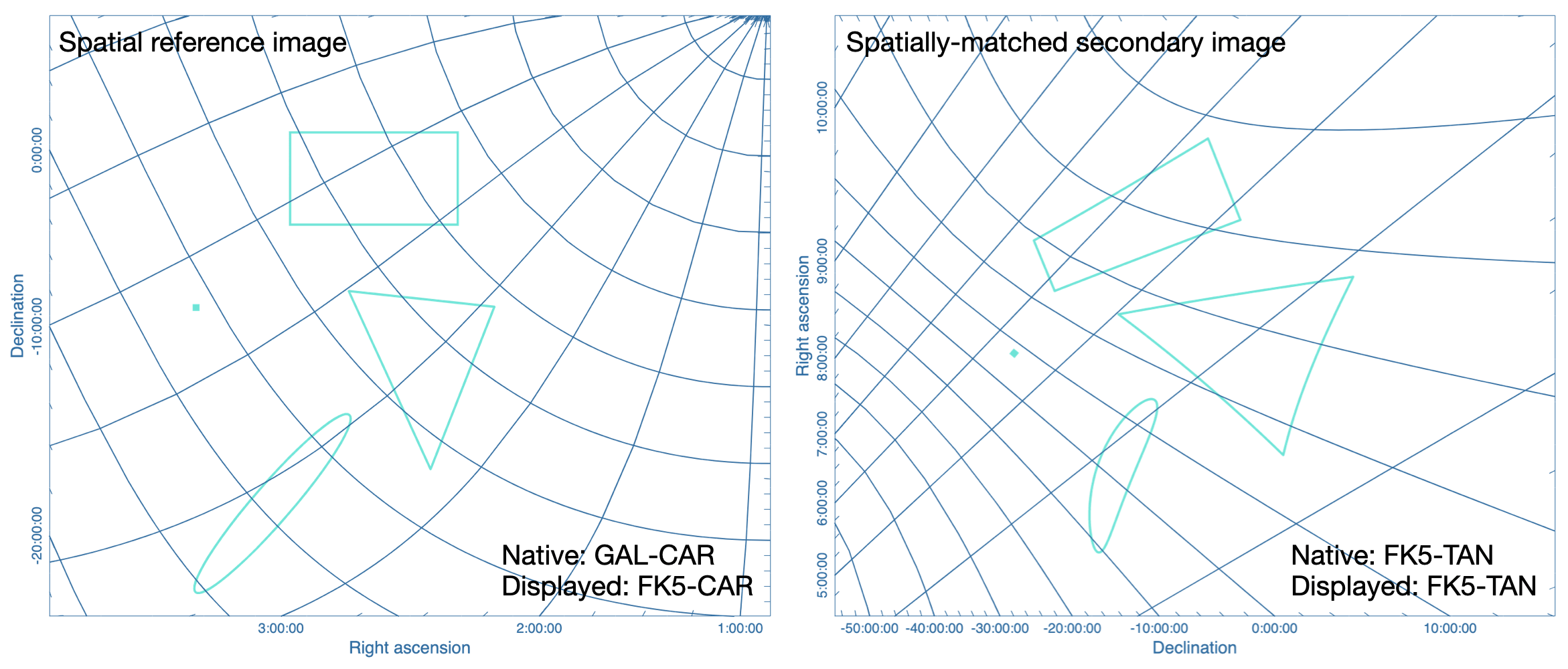
When a region is created on one of the spatially matched images, effectively the region is created on the image served as the spatial reference, regardless which image is being viewed. Then, the region is shared and rendered to other spatially matched images with the considerations of projection effects and difference in coordinate reference systems. Regions (except the point region) are approximated by polygons and each control point is transformed from the spatial reference image to the spatially-matched secondary image. In this way, the solid angles of the regions before and after polygonal approximation are nearly identical thus analytics of the same region among different spatially matched images can be compared directly.
In the following exaggerated example, two images with different coordinate systems and projection schemes are spatially matched. Regions on the spatial reference image retain their shapes. Polygon approximated regions on the spatially-matched secondary image may have visible distortions, depending on the projection schemes. In most use cases, the region distortion effect should be much less noticable if the field of view of the image is small.
Shared line/polyline region with conserved angular length
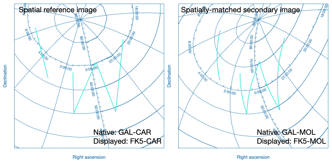
Similar to the polygon approximation of closed regions, for the line and polyline regions, each line segment is approximated as a polyline on the spatially-matched secondary image. In this way, the angular length of the trajectory traced by the line or polyline region before and after polyline approximation are nearly identical.
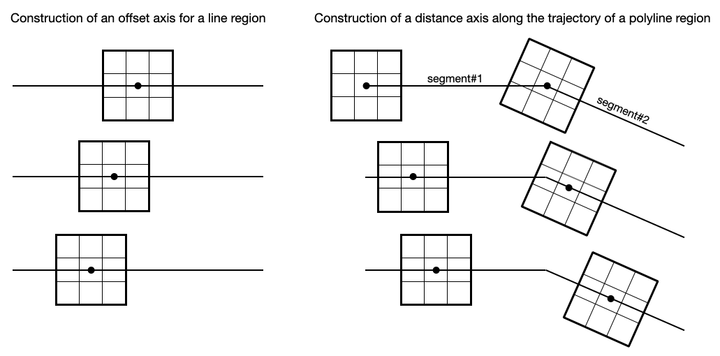
When a spatial profile is derived from a line or a polyline region, a set of boxes with a “height” (parallel to the trajectory) of three unit steps and a custom “width” (perpendicular to the trajectory) in number of unit steps are created along the trajectory. These hidden boxes are created on the reference image first. Then similar to the polygon approximation of closed regions, these “boxes” are transformed to the spatially-matched secondary image to derived a spatial profile. If the image is considered as “flat” without noticible distortion, the unit step refers to an image pixel. However, if the image is considered as “wide” with noticible distortion, the unit step refers to the angular size of an image pixel as defined in the image header. In this case, the boxes retain approximatedly a fixed solid angle. With all these approximations, spatial profiles of the same trajectory among different spatially matched images can be compared directly. The same idea is applied to the position-velocity image generator with a line region.
Shared region management
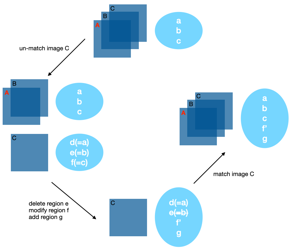
When regions are created on one of the spatially matched images, they are all registered to the spatial reference image for matching. The regions are shared to all the matched images, thus analytics can be derived and compared directly. When an image is unmatched with respect to the spatial reference image, the image will get a copy of all regions. This set of regions is now independent of the region set belonging to the matched images. If there are modifications of the regions and you try to match the image to the matched images again, only those modified regions will be copied to the region set of the matched images. The following diagram illustrates the idea.
Analytics with shared regions
Shared region of interest enables practical image cube analysis through
- statistics widget
- histogram widget
- spectral profiler widget
- spatial profiler widget
- Stokes analysis widget
- PV image generator widget
These widgets contains an “Image” dropdown menu and a “Region” dropdown menu. The former allows you to select which loaded image cube to show its analytics. The latter allows you to select which region to show the region analytics. With the combination of the two menus, CARTA provides a flexible user interface to explore image data. When the selected image has the polarization axis, you can use the “Polarization” dropdown menu to select which polarization component to use for deriving image analytics.
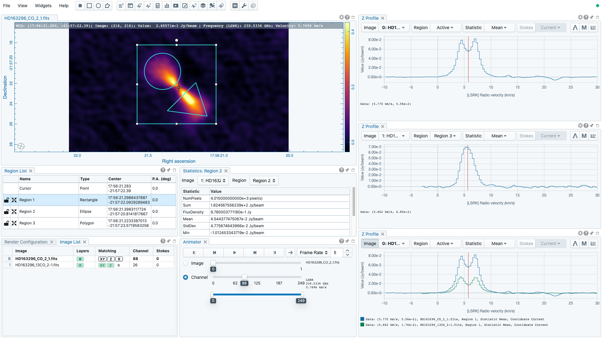
As an example below, two image cubes representing 12CO 2-1 and 13CO 2-1 are matched spatially and spectrally. Three shared regions are created to highlight different features. Three spectral profiler widgets are placed to show different profiles. The top one shows the square region profile from 12CO 2-1. The middle one shows the polygon region profile of 13CO 2-1. The bottom one shows both 12CO 2-1 and 13CO 2-1 profiles from the square region. Please refer to the section Spectral profiler to learn how to plot multiple profiles in one spectral profiler widget. In addition, one statistics widget is configured to show the statistics of 13CO 2-1 from the circle region.
Region import and export
CARTA supports region import and export capability. Regions, in world coordinates or in image coordinates, can be exported to a text file or imported from a text file. To import a region file, use the menu “File”” -> “Import regions”. A shortcut button can be found in the region list widget too.
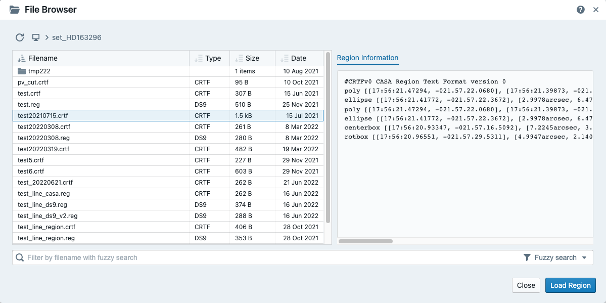
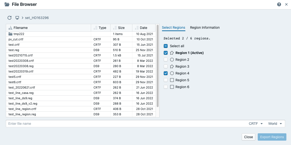
To export regions to a region file, use the menu File -> Export regions. A shortcut button can be found in the region list widget too. You can use the dialog to select a subset of regions to be saved in a region text file.
As of v3.0.0, CASA region text format (.crtf) and ds9 region text format (.reg) are supported with some limitations. Currently only the 2D region definition is supported. Other properties, such as spectral range or reference frame will be supported in future releases.
The supported CRTF region syntax is summarized below:
- Rectangle
- box[[x1, y1], [x2, y2]]
- centerbox[[x, y], [x_width, y_width]]
- rotbox[[x, y], [x_width, y_width], rotang]
- Ellipse
- circle[[x, y], r]
- ellipse[[x, y], [bmaj, bmin], pa]
- Polygon
- poly[[x1, y1], [x2, y2], [x3, y3], …]
- Polyline
- polyline[[x1, y1], [x2, y2], [x3, y3], …]
- Line
- line[[x1, y1], [x2, y2]]
- Point
- symbol[[x, y], .]
Please refer to https://casadocs.readthedocs.io/en/latest/notebooks/image_analysis.html#Region-File-Format for more detailed descriptions about the CRTF syntax.
The currently supported ds9 region syntax is summarized below:
- Rectangle
- box x y width height angle
- Ellipse
- ellipse x y radius radius angle
- circle x y radius
- Polygon
- polygon x1 y1 x2 y2 x3 y3 …
- Polyline
- polyline x1 y1 x2 y2 x3 y3 …
- Line
- line x1 y1 x2 y2
- Point
- point x y
Please refer to http://ds9.si.edu/doc/ref/region.html for more detailed descriptions about the ds9 region syntax.
Spatial profiler
The spatial profiler provides the spatial profiles at the cursor position, at the point region, along a line region, and along a polyline region.
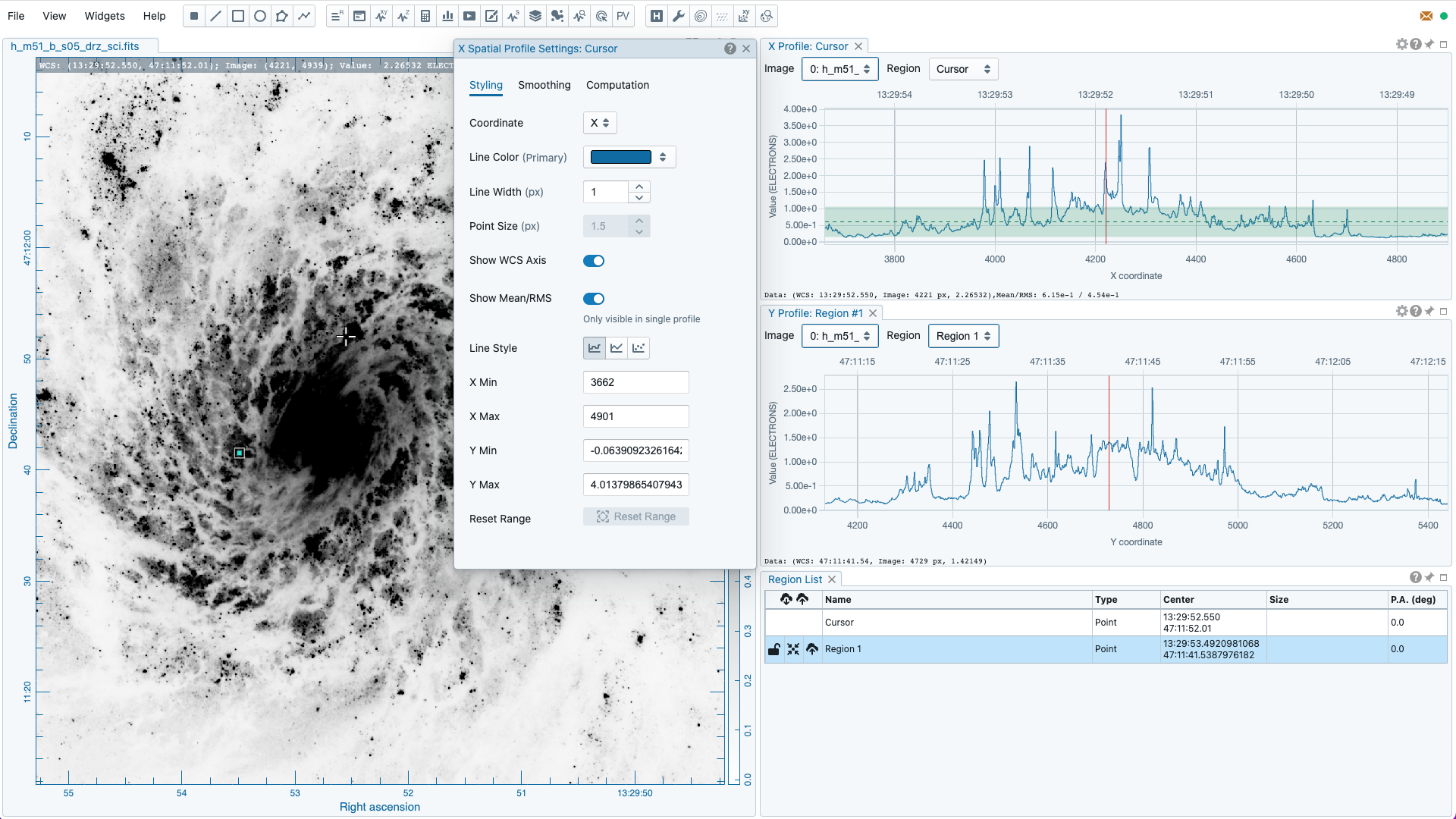
When the “Region” dropdown menu is set to “cursor” or a point region, a horizonal or a vertical profile is extracted from the “Image” depending on the selection in th settings dialog (the “cog button at the top right corner”). When the cursor is moving on the image, profiles derived from the full resolution raster image are displayed. The “F” key will disable or enable profile update. When cursor update is disabled, a marker “+” will be placed on the image to indicate the position of the profiles taken.
When a spatial profile is derived from a line or a polyline region, a set of boxes with a “height” (parallel to the trajectory) of three unit steps and a custom “width” (perpendicular to the trajectory; set with the “Computation” tab of the settings dialog) in number of unit steps are created along the trajectory. These hidden boxes are created on the reference image first. Then similar to the polygon approximation of closed regions, these “boxes” are transformed to the spatially-matched secondary image to derived a spatial profile. If the image is considered as “flat” without noticible distortion, the unit step refers to an image pixel. However, if the image is considered as “wide” with noticible distortion, the unit step refers to the angular size of an image pixel as defined in the image header. In this case, the boxes retain approximatedly a fixed solid angle. With all these approximations, spatial profiles of the same trajectory among different spatially matched images can be compared directly.
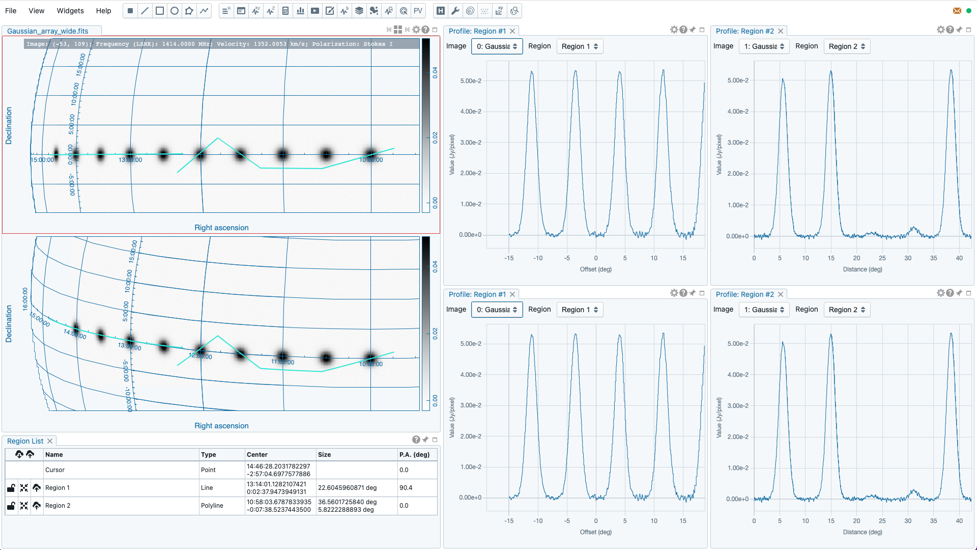
For a line region, an “offset” axis is constructed to compute a spatial profile. The origin is the middle point of the line region. For a polyline region, a “distance” axis is constructed to compute a spatial profile along the trajectory. The origin is the first control point of the polyline. Note that sampling artifacts may be seen near the end points of a line region or near each control point of a polyline due to the rounding effect of the sampling process.
Note
When the sampling process is made along a line region or a polyline region in a “”non-flat” image, the solid angle of the sampling boxes is approximated conserved. In some cases, especially when image is highly distorted, some computed boxes may cover zero image pixel for profile calculations. Therefore, you may see NaN values in the final spatial profile. When this situation happens, you can consider to increase the averaging “width” with the “Computation” tab of the settings dialog.
In a future release, the averaging “height” (parallel to the trajectory) can be customized too. With the v3.0.0 release, the “height” is fixed to three (three pixels for flat image or three pixel angular size for non-flat image).
When displaying a spatial profile with the number of pixels more than the number of screen pixels of the spatial profiler widget, a decimated profile will be derived and displayed as an enhancement of performance. Min/max decimation of a profile is adopted to ensure profile features are preserved. In other words, positive and negative peaks should stay at the same screen pixels just like displaying the full resolution profile. When you keep zooming in the profile, decimation with narrower and narrower intervals is applied dynamically. Full resolution profile is displayed when the number of screen pixels is more than the number of pixels of the profile to be displayed.
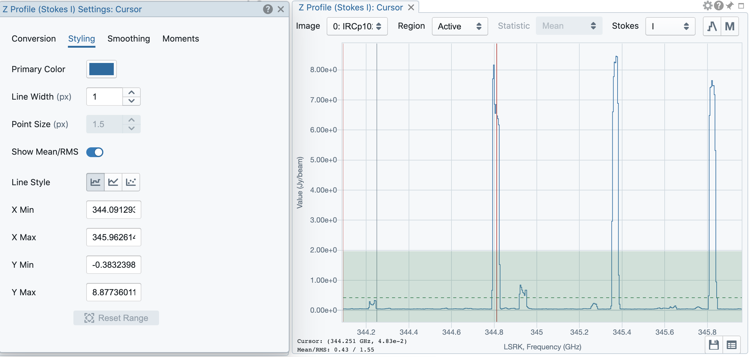
The interactions of the spatial profiler widget are demonstrated in the section Mouse interactions with charts. The red vertical bar indicates the pixel where the profile is taken. The bottom axis shows the image coordinate, while optional world coordinate is displayed on the top axis. Extra options to configure the profile plot are available in the spatial profiler settings dialog which is launched by clicking the “cog” button at the top-right corner. The option “Show Mean/RMS” in the “Styling” tab will adopt the data in the current view to derive a mean value and an rms value, and visualize the results on the plot. Numerical values are also displayed at the bottom-left corner. Optionally, the profile can be smoothed with different methods provided in the “Smoothing” tab (see section Profile smoothing). The profile can be exported as a PNG image or a text file in TSV format via the buttons at the bottom-right corner when you hover over the plot.
When the cursor is on the image in the image viewer, the pointed pixel value (pixel index and pixel value) will be displayed at the bottom-left corner of the spatial profiler. When the cursor is on the spatial profiler graph, the pointed profile data will be displayed instead.
Note
Profile fitting capability will be added in a future release.
Spectral profiler
The spectral profiler widget allows you to view region spectra from image cubes. There are two modes:
- single-profile mode (when none of the “Image”/”Region”/”Statistic”/”Polarization” checkboxes is selected)
- multiple-profile mode (when one of the “Image”/”Region”/”Statistic”/”Polarization” checkboxes is selected)
The single-profile mode allows you to create multiple spectral profiler widgets and compare spectra side by side. The multiple-profile mode, however, shows multiple spectra in one plot with same x and y ranges so that spectra can be compared directly.
Single-profile mode
The configuration of how spectral profiles are extracted from image cubes and displayed is determined by the four dropdown menus and their selection states. When there is no checkbox selected, the spectral profiler widget displays one spectrum only depending on the selection of each dropdown menu (”Image”, “Region”, “Statistic”, and “Polarization”). When regions are created, the spectral profiler widget can be configured to display a profile from a specific region with the “Region” dropdown menu. The default of the “Region” dropdown menu is “Active” which points to the current active (selected) region. If no region is active, it defaults to cursor region. Additional statistic types to compute the region spectral profile are available with the “Statistic” dropdown menu (default to mean). If the image cube has multiple polarization components, the “Polarization” dropdown menu will be activated and defaulted to “Current” which is synchronized with the selection in the animator. To view a specific polarization component, select with the “Polarization” dropdown menu.
Multiple spectral profile widgets can be configured to display different region (”Region” dropdown menu) spectral profiles from different image cubes (”Image” dropdown menu) and polarization (”Polarization” dropdown menu, if applicable) with different statistics (”Statistic” dropdown menu), allowing a side-by-side comparison of spectra.
Multiple-profile mode
When one of the “Image”, “Region”, “Statistic”, and “Polarization” checkboxes is selected, the spectral profiler widget switches to the multiple-profile mode. CARTA support four different use cases as the following:
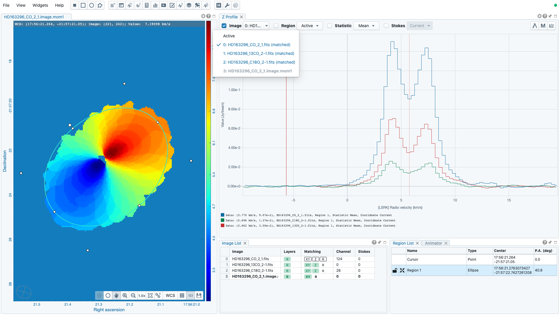
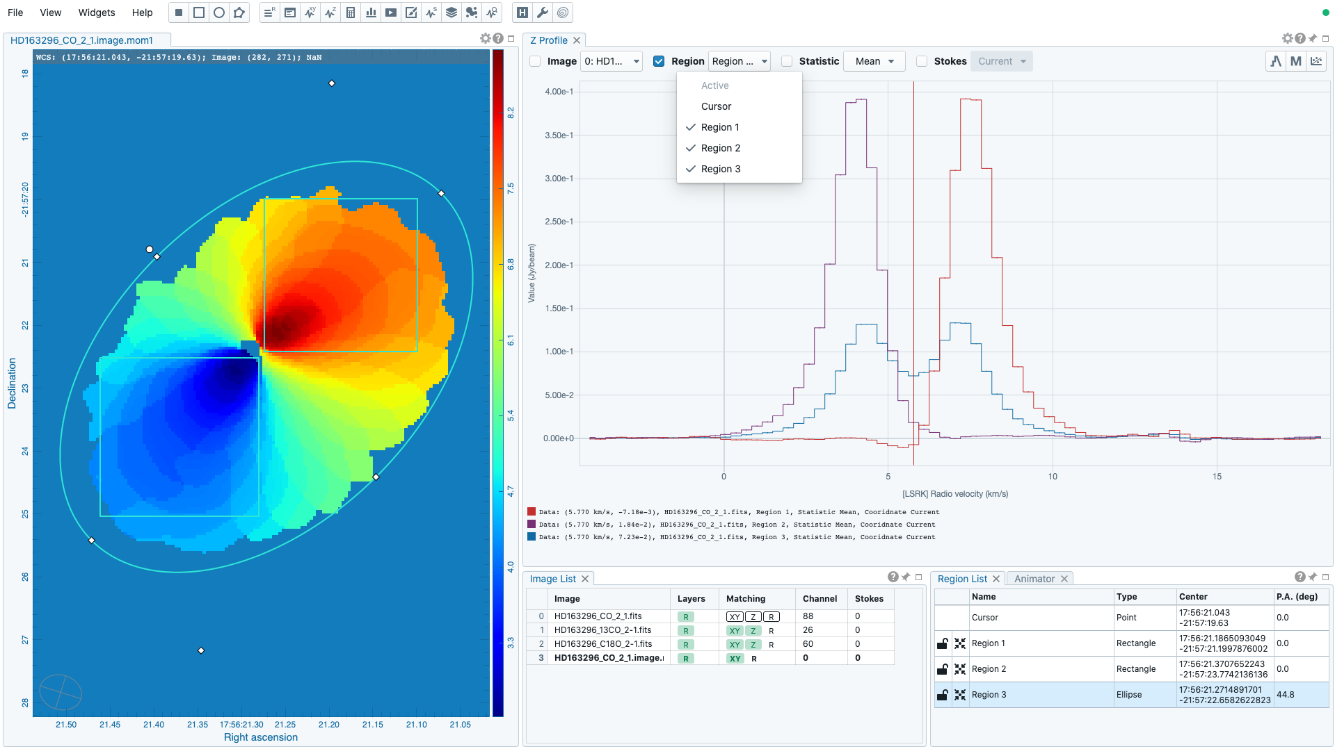
Comparing spectra from different image cubes: When the “Image” checkbox is selected, spectral profiles from different spatially and spectrally matched cubes can be displayed. The “Image” dropdown menu shows the matching state of each image as configured via the image list widget. The dropdown menu allows single-selection only. The selected image and its matched images are used for spectral profile computations based on the selected region (single selection), statistic (single selection), and polarization (if applicable, single selection). In the following example, CO 2-1, 13CO 2-1, and C18O 2-1 lines from the source HD163296 are plotted for comparison. The profiles are derived from the rectangle region with mean statistics.
Comparing spectra from different regions: When the “Region”” checkbox is selected, spectral profiles from different regions of an image cube can be displayed. The “Region” dropdown menu allows multiple-selection of different regions. The region spectral profiles will be computed based on the selected image (single selection), statistic (single selection), and polarization (if applicable, single selection). In the following example, CO 2-1 mean spectra from different parts of the protoplanetary disk HD163296 are compared.
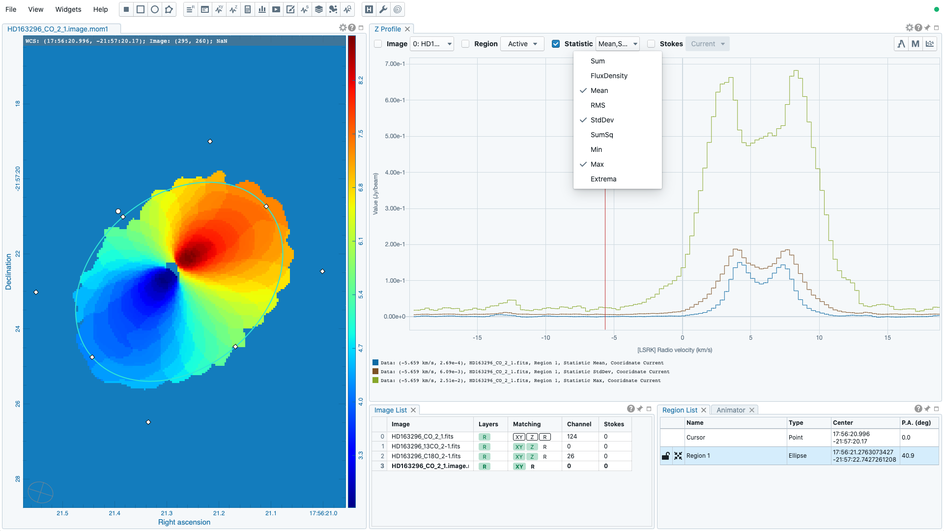
Comparing spectra with different statistical quantities: When the “Statistic” checkbox is selected, region spectral profiles with different statistical quantities can be displayed. The “Statistic” dropdown menu allows multiple-selection of different statistical quantities. The region spectral profiles will be computed based on the selected image (single selection), region (single selection), and polarization (if applicable, single selection). In the following example, CO 2-1 mean, standard deviation, and max spectra are compared. The profiles are derived from the ellipse region.
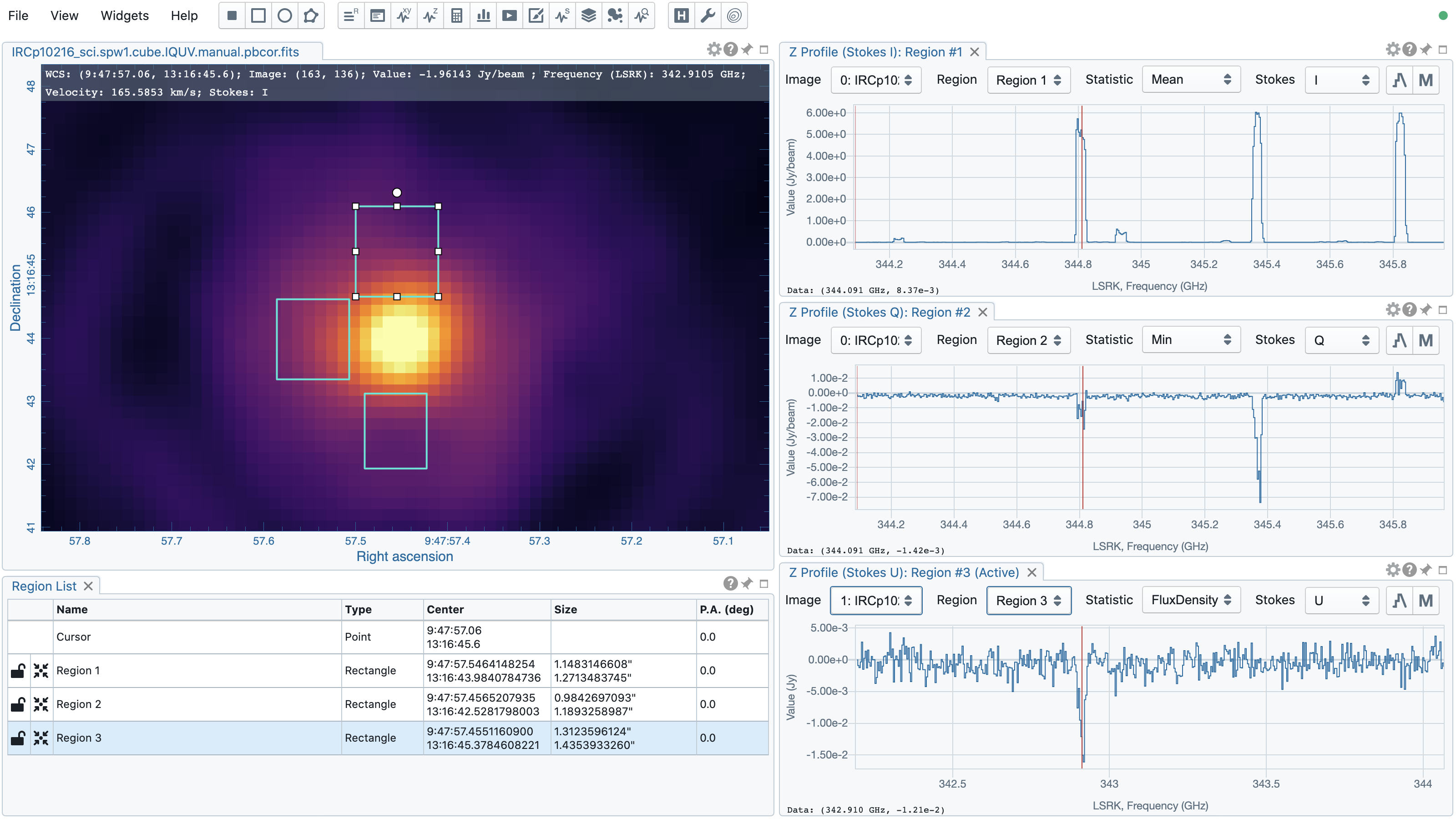
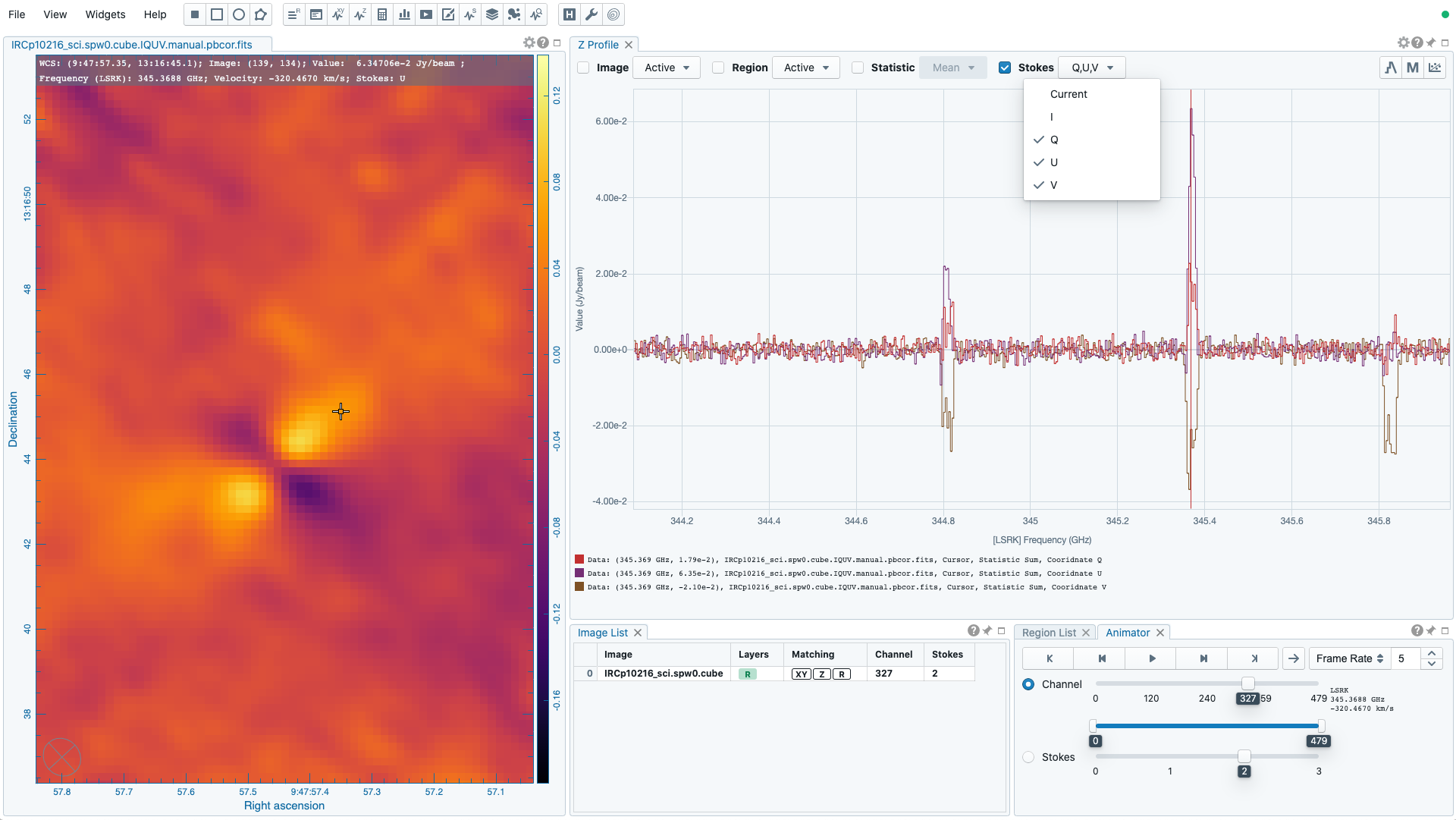
Comparing spectra with different Stokes parameters: When the “Polarization” checkbox is selected, region spectral profiles with different polarization components can be displayed. The “Polarization” dropdown menu allows multiple-selection of different polarization components. The region spectral profiles will be computed based on the selected image (single selection), region (single selection), and statistic (single selection). In the following example, Stokes Q, U and V single-pixel spectra from IRC+10216 are compared.
Note
Only one of the “Image”, “Region”, “Statistic”, and “Polarization” checkboxes can be selected at one time. Plotting spectral profiles from different images and from multiple regions, for example, is not allowed.
The default region is set to “Cursor”. The “F” key will disable or enable cursor profile update. When cursor update is disabled, a marker “+” will be placed on the image to indicate the position of the profile taken.
When requesting a spectral profile, a common disappointing user experience is that you may have to wait for an unknown amount of time to see the final result if the image cube is large. As an improvement on this aspect, CARTA supports progressive update of spectral profile. Partial profiles will be periodically delivered to the frontend while the full profile calculations at the backend are still ongoing.
When the property of a region (cursor or a regular region) is modified while the profile of the original region is updating, the partial profile will disappear and a new partial profile corresponding to the new region will start updating. If you modify the request of a spectral profile via the spectral profile widget before it is fully delivered, the original profile calculations will be cancelled and new profile calculations will start. In short, CARTA should just focus on calculating and showing the profiles that you are paying attention to. If a profile no longer needs to be shown on the screen, the profile calculation will be cancelled immediately, instead of blocking and queueing up new profile requests.
When displaying a spectral profile with the number of channels more than the number of screen pixels of the spectral profiler widget, a decimated profile will be derived and displayed to you as an enhancement of performance. Min/max decimation of a profile is adopted to ensure profile features are preserved. In other words, positive and negative peaks should stay at the same screen pixels just like displaying the full resolution profile. When you keep zooming in the profile, decimation with narrower and narrower intervals is applied dynamically. Full resolution profile is displayed when the number of screen pixels is more than the number of pixels of the profile to be displayed.
The interactions of the spectral profiler widget are demonstrated in the section Mouse interactions with charts. The red vertical bar indicates the channel of the image displayed in the image viewer. Clicking directly on the spectral profiler graph will change the displayed image to the clicked channel. Alternatively, the red vertical bar is draggable and acts just like the channel slider of the animator widget.
The bottom axis shows the spectral coordinate. Additional options to configure the profile plot are available in the spectral profile settings dialog which can be launched by clicking the “cog” button in the top-right corner. In the dialog, you may select a different spectral convention (e.g., optical velocity) and a different reference system (e.g., TOPO) with the “Conversion” tab. You can also apply an intensity unit conversion with the “Conversion” tab. The option “Show Mean/RMS” in the “Styling” tab will adopt the data in the current view to derive a mean value and an rms value, and visualize the results on the plot. Numerical values are also displayed at the bottom-left corner. When the cursor is on the image in the image viewer, the pointed pixel value (frequency or velocity or channel index, and pixel value) will be displayed at the bottom-left corner of the spectral profiler. When the cursor is on the spectral profiler graph, the pointed profile data will be displayed instead. Optionally, the displayed profile can be smoothed via the options in the “Smoothing” tab (see section Profile smoothing). Image collapsing is available in the “Moments” tab. Various image moments and statistics are supported (see section Moment map generator). Profile fitting is available in the “Fitting” tab (see section Profile fitting). The profile can be exported as a PNG image or a text file in TSV format via the buttons at the bottom-right corner.
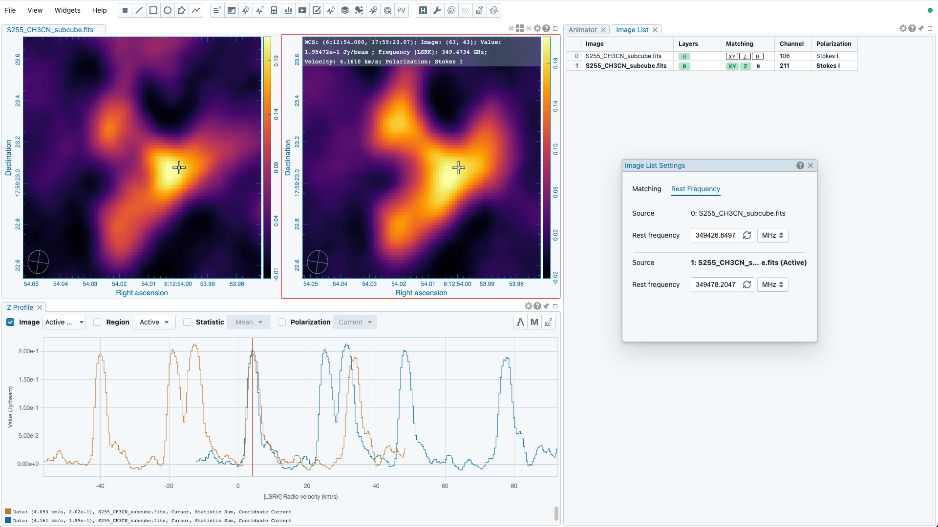
A custom reference rest frequency can be applied to an image cube to overwrite the “RESTFRQ” header temporarily with the settings dialog of the image list widget. Once a custom rest frequency is given, the velocity axis will be re-computed. This allows you to compare different spectral line profiles in the velocity domain efficiently without changing the the “RESTFRQ” header repeatedly and permanently. Note that with the “File” -> “Save image” dialog, you can set a new rest frequency to the saved image (i.e., overwriting the “RESTFRQ” header).
In the following example, a cube containing five major spectral lines is loaded twice in CARTA. Two custom rest frequencies are applied to the cubes, respectively. With the multiple-profile plotting mode, we can compare the two target profiles in the velocity domain directly as their velocites have been recomputed based on the custom rest frequencies, instead of based on the “RESTFRQ” header. As the velociy axis of each cube is recomputed, spectral matching in the velocity domain is re-applied automatically. Images from the two target lines can be compared directly near the systemic velocity of the source.
Note
Intensity unit conversion in the multiple-profile plotting mode will be available in a future release.
Moment map generator
Moment images (i.e., collapsed cube along the spectral axis) can be generated and viewed with CARTA. A shortcut button, linking to the “Moments” tab of the spectral profilers settings dialog, can be found at the top-right corner of the spectral profiler widget.
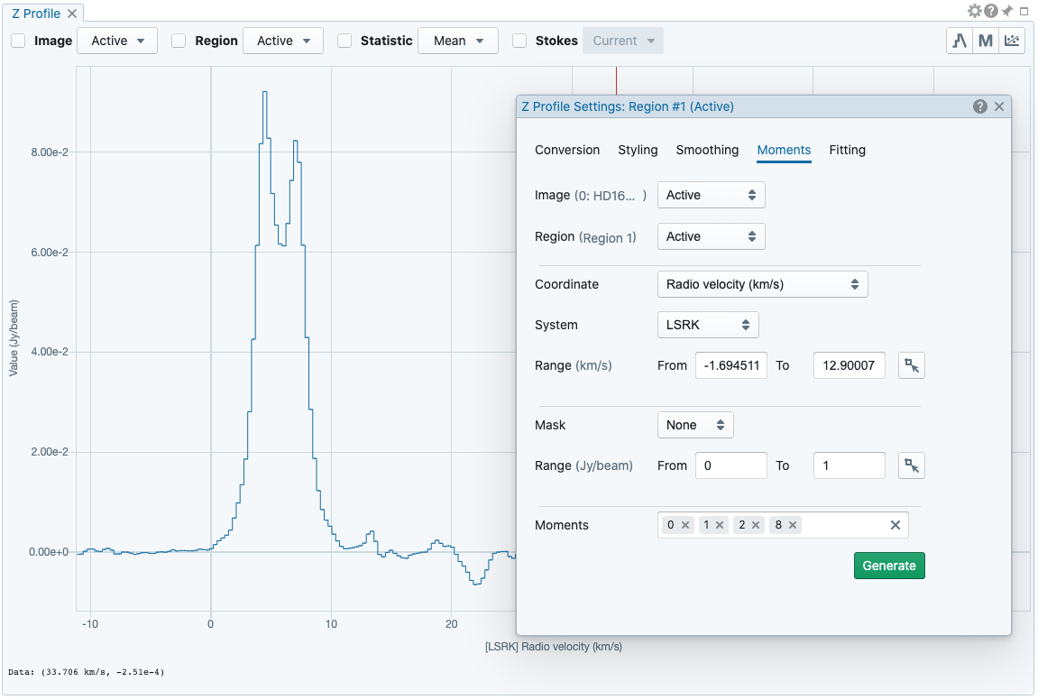
The “Moments” tab provides several control parameters to define how moment images are calculated, including:
- Image: the input image file for moment calculations. “Active” refers to the image displayed in the image viewer.
- Region: a region can be selected so that moment calculations are limited inside the region. “Active” refers to the selected region in the image viewer. If no region is selected, the full image is included in the moment calculations.
- Coordinate, System, and Range: the spectral range (e.g., velocity range) used for moment calculations is defined with these options. The range can be defined either via the text input fields, or via the cursor by dragging horizontally in the spectral profiler widget.
- Mask and Range: these options define a pixel value range used for moment calculations. If the mask is “None”, all pixels are included. If the mask is “Include” or “Exclude”, the pixel value range defined in the text input fields is included or excluded, respectively. Alternatively, the pixel value range can be defined via the cursor by dragging vertically in the spectral profiler widget.
- Moments: which moment images to be calculated are defined here. Supported options are:
- -1: Mean value of the spectrum
- 0: Integrated value of the spectrum
- 1: Intensity weighted coordinate
- 2: Intensity weighted dispersion of the coordinate
- 3: Median value of the spectrum
- 4: Median coordinate
- 5: Standard deviation about the mean of the spectrum
- 6: Root mean square of the spectrum
- 7: Absolute mean deviation of the spectrum
- 8: Maximum value of the spectrum
- 9: Coordinate of the maximum value of the spectrum
- 10: Minimum value of the spectrum
- 11: Coordinate of the minimum value of the spectrum
When all the parameters are defined, by clicking the “Generate” button, moment calculations will begin. Depending on the file size, moment calculations may take a while. If that happens, you may optionally cancel the calculations and re-define a proper region and/or spectral range.
Note
As of v3.0.0, the moment images are computed along the spectral axis only. In future release, calculations along other axes will be provided (e.g., R.A.).
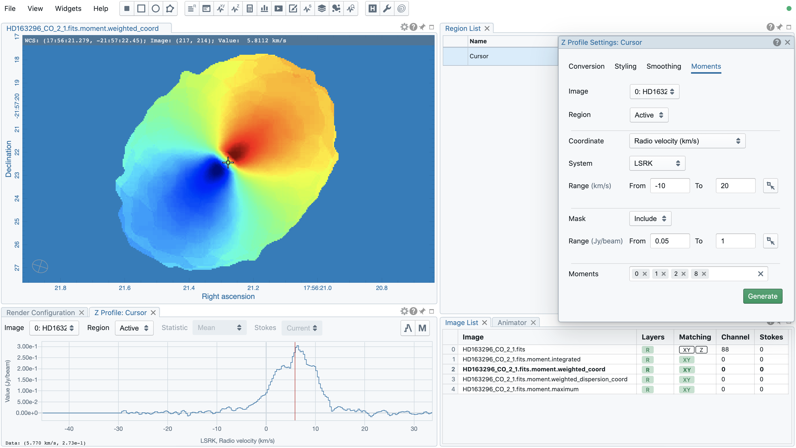
Once moment images are generated, they will be loaded and displayed in the image viewer. They are named as $image_filename.moment.$keyword. For example, if moment 0, 1 and 2 images are generated from the image M51.fits, they will be named as M51.fits.moment.integrated, M51.fits.moment.weighted_coord, and M51.fits.moment.weighted_dispersion_coord, respectively. These images are kept in RAM per session and if there is a new request of moment calculations, these images will be deleted first. Optionally, calculated moment images can be exported in CASA or FITS format via “File”” -> “Save image”.
Warning
In a resumed session after a broken connection to the backend, all in-memory images, such as the images generated with the moment generator, are lost. Those images will not be accessible in the resumed session.
Position-Velocity (PV) image generator
A position-velocity (PV) image is usually used to study source kinematics. In CARTA, you can use the PV generator widget to generate a PV image. As of v3.0.0, only a line region can be selected as the PV cut. In a future release, a polyline region will be supported.
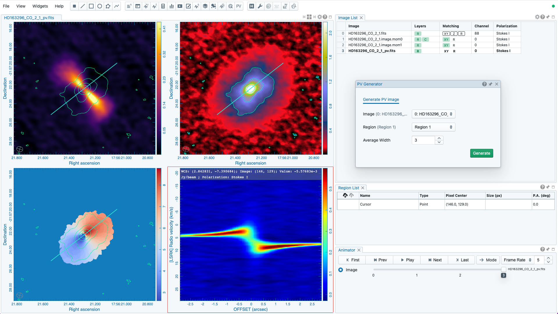
When a PV image is derived from a line region, a set of boxes with a “height” (parallel to the trajectory) of three unit steps and a custom “width” (perpendicular to the trajectory; set with the “Averaging Width” spinbox) in number of unit steps are created along the trajectory. These hidden boxes are created on the reference image first. Then similar to the polygon approximation of closed regions, these “boxes” are transformed to the spatially-matched secondary image to derived a PV image. If the image is considered as “flat” without noticible distortion, the unit step refers to an image pixel. However, if the image is considered as “wide” with noticible distortion, the unit step refers to the angular size of an image pixel as defined in the image header. In this case, the boxes retain approximatedly a fixed solid angle. With all these approximations, PV images of the same trajectory among different spatially matched images can be compared directly.
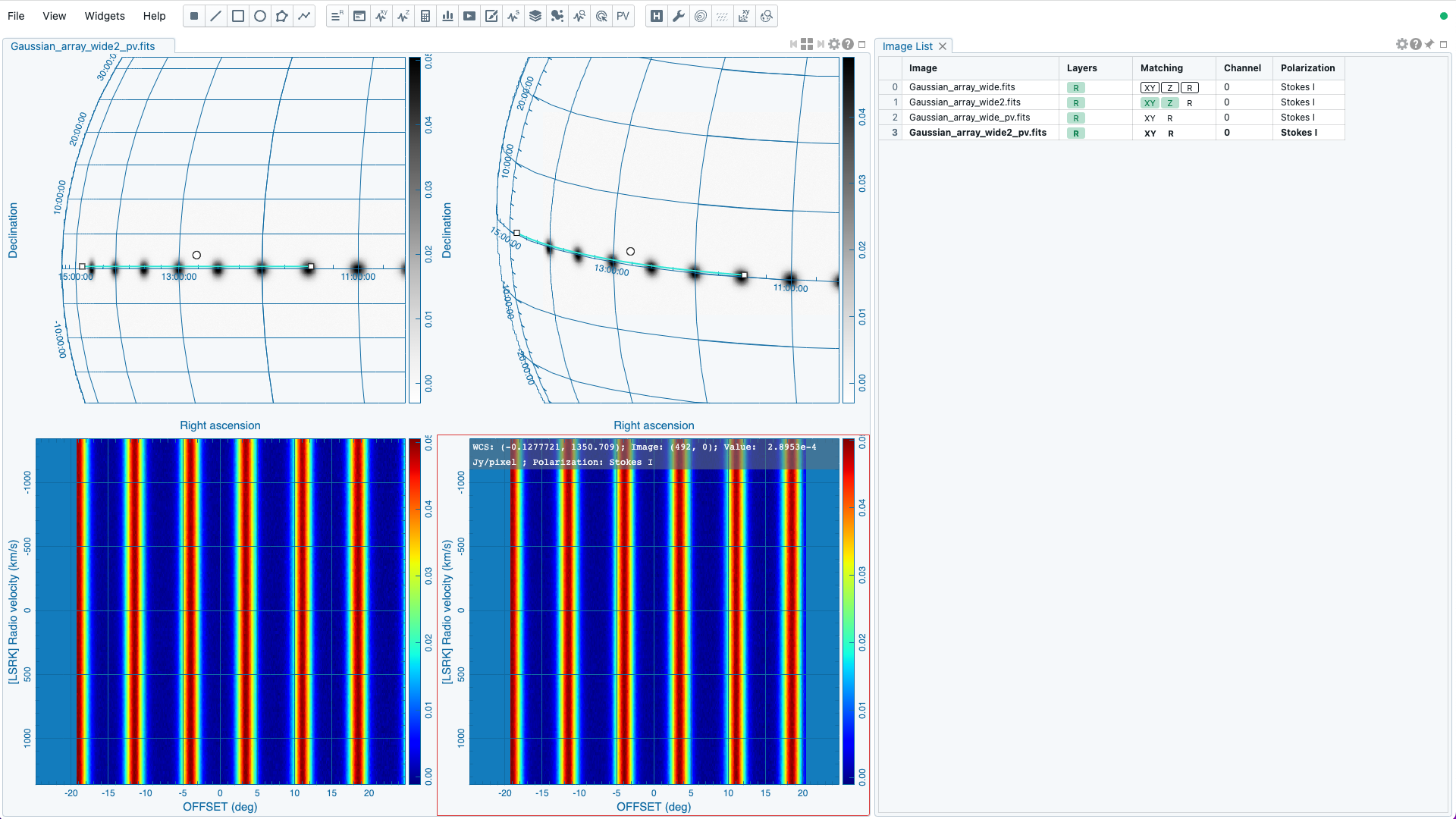
As a scalable approach for large image cubes, CARTA constructs a PV image from a series of region spectral profiles along the line region (PV cut), instead of re-gridding the input image cube first so that the PV cut becomes a horizontal one for the temporary cube. The final PV image is an ensemble of region spectral profiles at different sampled offset locations. During the PV image generation process, a progress bar will be displayed with a “Cancel” button. The process can be cancelled at any time.
Note
When the sampling process is made along a line region in a “”non-flat” image, the solid angle of the sampling boxes is approximated conserved. In some cases, especially when image is highly distorted, some computed boxes may cover zero image pixel for spectral profile calculations. Therefore, you may see NaN stripes in the final PV image. When this situation happens, you can consider to increase the averaging “width” with the “Averaging Width” spinbox.
In a future release, the averaging “height” (parallel to the trajectory) can be customized too. With the v3.0.0 release, the “height” is fixed to three (three pixels for flat image or three pixel angular size for non-flat image).
Once a PV image is generated, it will be loaded and displayed in the image viewer. It is named with an addtional “_pv” string in the original input file name. The generated PV image is kept in RAM per session and if there is a new request of PV image generation, the old PV image will be deleted first. Optionally, a calculated PV image can be exported in CASA or FITS format via “File”” -> “Save image”.
Warning
In a resumed session after a broken connection to the backend, all in-memory images, such as the images generated with the PV generator, are lost. Those images will not be accessible in the resumed session.
Note
In future release, the following feature will be supported:
- interactive PV image preview
- generation of a PV image along a polyline region
- generation of a PV image with a custom spectral range
2D image fitting
An initial implementation of the 2D image fitting feature is available in the v3.0.0 release. With the image fitting dialog, you can configure a set of 2D Gaussian models to fit your target sources.
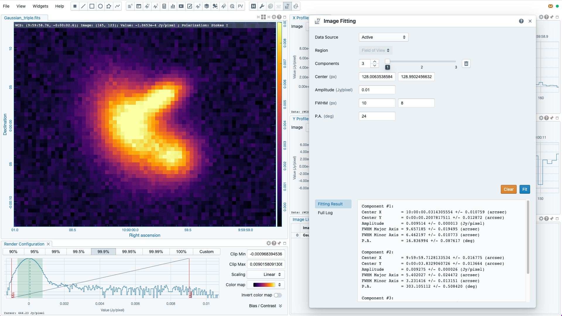
If there are multiple images loaded in CARTA, you can use the “Data Source” dropdown menu to select which image for the image fitting process. With the v3.0.0 implementation, the image pixels within the image view are taken as the input data for the image fitter. Pixels outside the image view are ignored. With the “Component” spinbox and slider, you can set manually a number of Gaussian components. For each Gaussian component, you need to specify a set of initial guess. Please note that if there are multiple Gaussian components, a more accurate initial guess helps the fitter to converage more quickly to a stable location on the hypersurfce.
Once the model Gaussian components are set, you can click the “Fit” button to trigger the fitting process. The short summary of the fitting result will be displayed in the “Fitting Result” tab and a full fitting log will be available in the “Full log” tab. By clicking the “Clear” button, the widget is reset to its initial state.
Note
In future releases, the 2D image fitting function will be enhanced with the following features:
- select a region as the input pixels for the fitting process
- fix Gaussian parameters in the fitting process
- generate and visualize the model image and the residual image
- set initial guess in world coordinates and angular scale
- export fitting results as a text file
- set the initial guess automatically based on the image feature (i.e., similar to the “guess” function in the spectral profile fitting function)
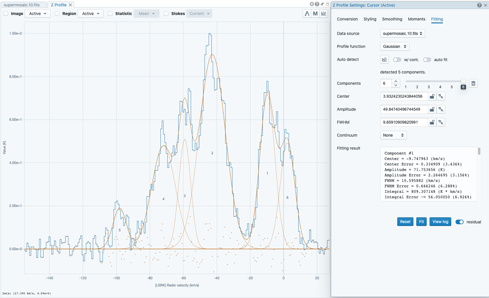
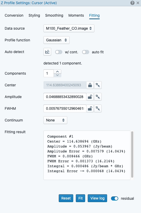
Profile fitting
As of v3.0.0, the profile fitting function can be applied to the spectral profiler widget as an estimate of the spectral line properties, such as amplitude, FWHM, center, and integrated area. The profile fitting function is available via the “Fitting” button at the top-right corner of the spectral profiler widget.
Note
In a future release, the profile fitting function will be added to the spatial profiler widget and the histogram widget.
CARTA supports two model profile functions in v3.0.0 (more will be added in a future release):
- Gaussian: thermal or random motion broadening
- Lorentzian: pressure broadening
In addition, a continuum emission as a constant distribution (0th-order polynomial) or a linear distribution (1st-order polynomial) can be included in the profile fitting process.
In order to work properly, a set of reasonable initial solutions needs to be provided to the fitting engine. CARTA provides flexible ways of setting up the initial solutions. They can be set manually with the text fields or with the cursor by drawing a box (for the profile function) or a line (for the continuum function) on the spectral profile plot. For each component, an amplitude, a FWHM, and a center need to be configured. Up to 20 components are supported in one single fit. When there are more than one component required in the fit, the “slider” can be used to switch to different components. The “delete” button can be used to delete a selected component.
Alternatively, the “auto detect” function (experimental) tries to analyze your spectral profile data and sets up the initial solutions automatically. If there is a prominent continuum emission or offset, please enable the “w/ cont.” toggle before clicking the “auto detect” button. If the “auto fit” toggle is enabled, the fitting engine will be triggered if the “auto detect” function found a set of initial solutions. When the “auto detect” function is applied, you may edit the initial solutions manually afterward, such as adding a new component, deleting an existing component, or refining a parameter, etc.
The fitting results are visualized in the spectral profile plot, including the individual model profiles, the synthetic model profile, and the residual profile. The numeric values of the fitting results are displayed in the “Fitting result” box. The fitting log is available by clicking the “View log” button. When the “Reset” button is clicked, the profile fitting function will be reset.
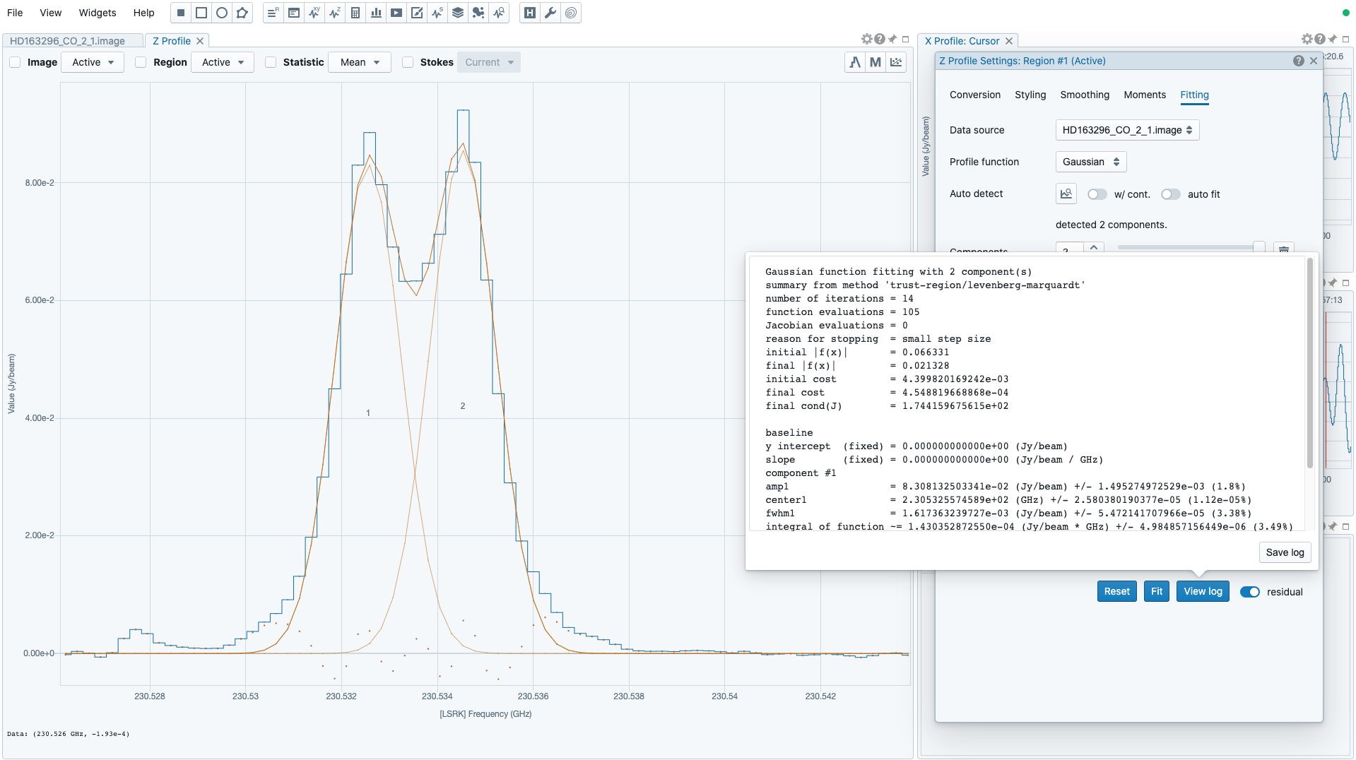
In some cases, a given free parameter, such as the center of a Gaussian component, may need to be fixed in order to obtain a sensible fit. This is supported with the “lock” button. Note that there needs to be at least one parameter unlocked in order to request a fit.
Note
The profile fitting function is not available when there are multiple profiles plotted in the spectral profiler widget. Please ensure that there is only one profile in the plot in order to use the profile fitting function.
Note
In future a release, the spectral profile fitting function will be enhanced by referencing the spectral line catalog so that the relative positions of the model components can be locked. Line width and relative amplitude can be constrained too.
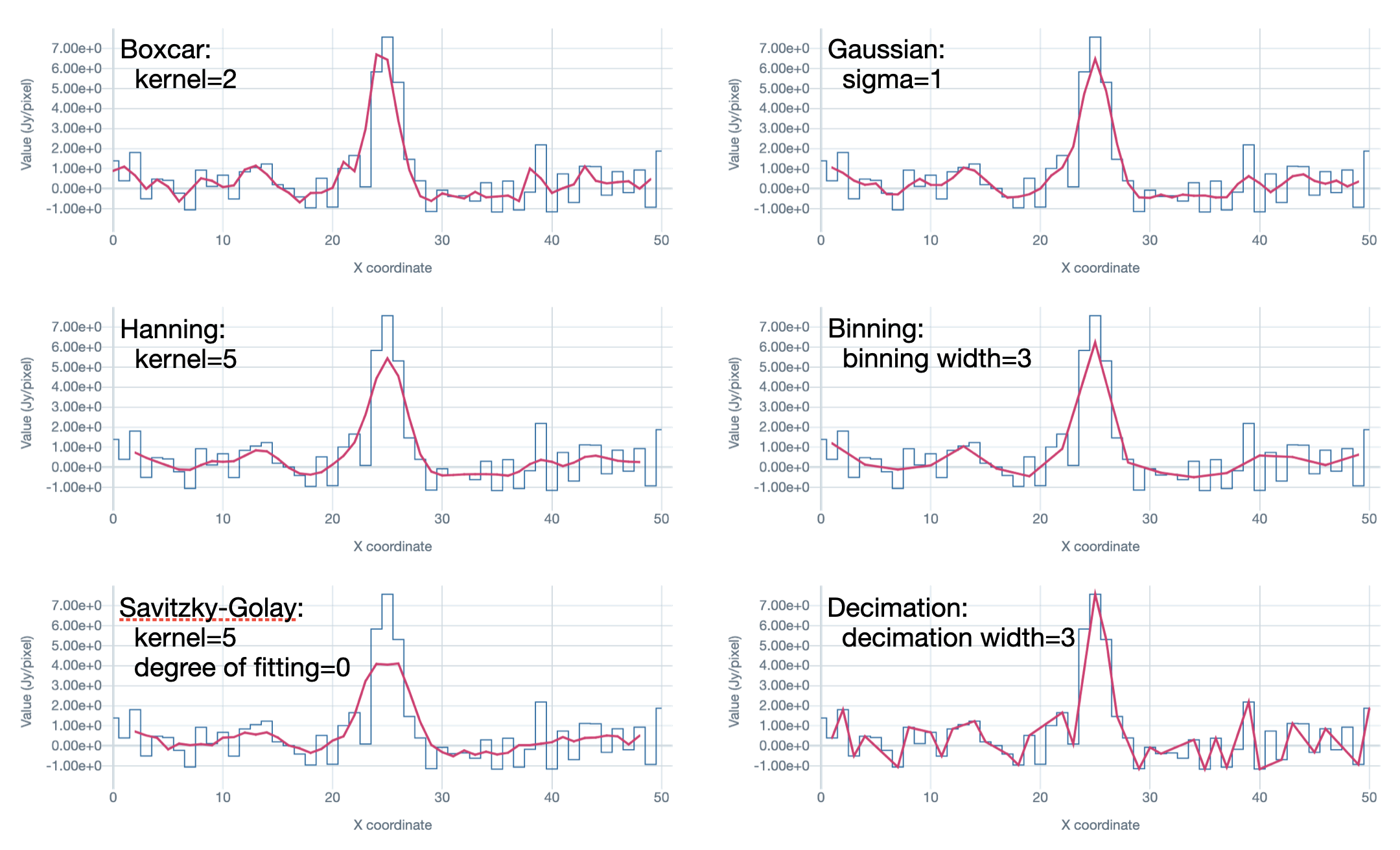
Profile smoothing
Profile Smoothing may be applied to profiles in the spatial profiler widget, the spectral profiler widget, and the Stokes analysis widget to enhance the signal-to-noise ratio.
CARTA provides the following smoothing methods:
- Boxcar: convolution with a boxcar function
- Gaussian: convolution with a Gaussian function
- Hanning: convolution with a Hanning function
- Binning: averaging channels with a given width
- Savitzky-Golay: fitting successive sub-sets of adjacent data points with a low-degree polynomial by the method of linear least squares
- Decimation: min-max decimation with a given width
Optionally, the original profile can be overplotted with the smoothed profile. The appearance of the smoothed profile, including color, style, width, and size, can be customized.
Spectral line query
CARTA supports an initial implementation of spectral line ID overlay on a spectral profiler widget based on the data from the Splatalogue service (https://splatalogue.online). The query is made by defining a spectral range in frequency or wavelength and optionally a lower limit of CDMS/JPL line intensity (logarithmic). The spectral range can be defined as “from-to” or “center-width”. Other filters, such as filtering by species name, or energy range, etc., can be applied after the data are retrieved from the Splatalogue.
Note
The current implementation has some limitations when making a query to the Splatalogue service:
- The allowed maximum query range, equivalent in frequency, is 20 GHz.
- The actual query is made with a frequency range in MHz rounded to integer.
- When an intensity limit is applied, only the lines from CDMS and JPL catalogs will be returned.
- Up to 100000 lines are displayed.
Improvements of the above limitations will be made in future releases.
Currently, the Splatalogue query service is under active development. Unexpected query results might happen. When you believe there is something wrong, please contact the CARTA helpdesk, or file an issue on Github (recommended).
Once a query is successfully made, the line catalog will be displayed in the tables. The upper table shows the column information in the catalog with options to show or hide a specific column. The actual line catalog is displayed in the lower table. The line catalog table accepts sub-filters such as partial string match or value range. For numeric columns, supported operators are:
>: greater than>=: greater than or equal to<: less than<=: less than or equal to==: equal to!=: not equal to..: between (exclusive)...: between (inclusive)
For examples:
- to filter everything less than 10, use
< 10 - to filter entries equal to 1.23, use
== 1.23 - to filter everything between 10 and 50 (exclusive), use
10..50 - to filter everything between 10 and 50 (inclusive), use
10...50
For string columns, partial match is adopted. For example, CH3 (no quotation) will return entries containing the “CH3” string.
The “Shifted Frequency” column is computed based on the user input of a velocity or a redshift. This “Shifted Frequency” is adopted for line ID overlay on a spectral profiler widget. You can use the checkbox to select a set of lines to be overplotted on a spectral profiler widget. The maximum number of line ID overlay is 1000.
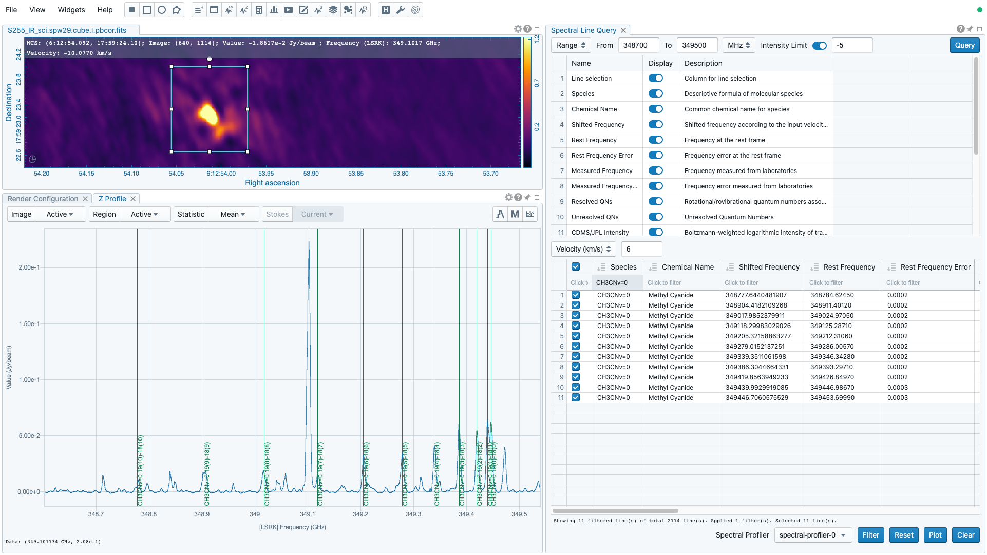
The text labels of the line ID overlay are shown dynamically based on the zoom level of a profile. Different line ID overlays (with different velocity shifts) can be created on different spectral profilers widgets via the “Spectral Profiler” dropdown menu. By clicking the “Clear” button, the line ID overlay on the selected “Spectral Profiler” will be removed.
Note
The sorting function in the line table will be available in a future release.
Note
When there are multiple profiles from different image cubes in the plot and the x-axis is in velocity, the line ID overlay function is disabled. This limitation will be removed in a future release.
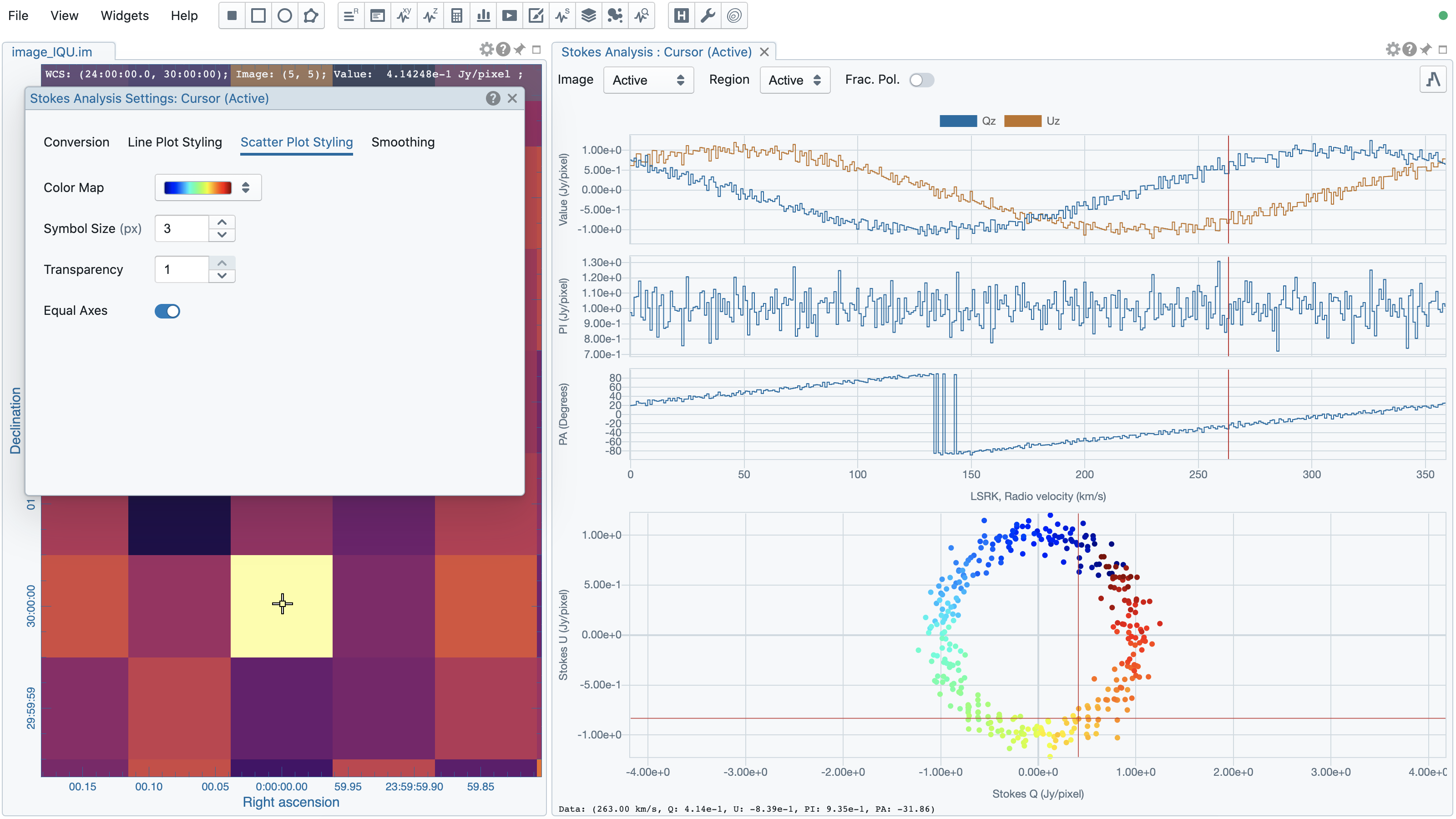
Stokes analysis widget
The Stokes analysis widget helps you to view basic polarization quantities of a multi-channel cube with multi-Stokes (IQU, QU, or IQUV) efficiently. If different Stokes images are stored as individual files (i.e., image_I.fits, image_Q.fits, image_U.fits, and image_V.fits), you can use the file browser dialog to create a Stokes hypercube by selecting multiple Stokes images and clicking the “Load as hypercube” button (see Forming a Stokes hypercube). Effectively, you will see that there is only one image loaded with multiple Stokes in CARTA.
The widget includes the following plots:
- Stokes Q intensity and Stokes U intensity over the spectral axis
- Linear polarization intensity over the spectral axis
- Linear polarization angle over the spectral axis
- Stokes Q intensity versus Stokes U intensity as a scatter plot
The profiles can be zoomed and panned with a mouse similar to the spatial profile widget or the spectral profile widget (Mouse interactions with charts). The Stokes Q versus Stokes U scatter plot is color-encoded from red to blue with increasing frequencies. The profiles can be requested at the cursor position (single pixel) or over a region of interest. Fractional polarization quantities are also supported if Stokes I is available. Examples are given in the following figures. The first one is from real ALMA data, while the second one is from an artificial Stokes cube.
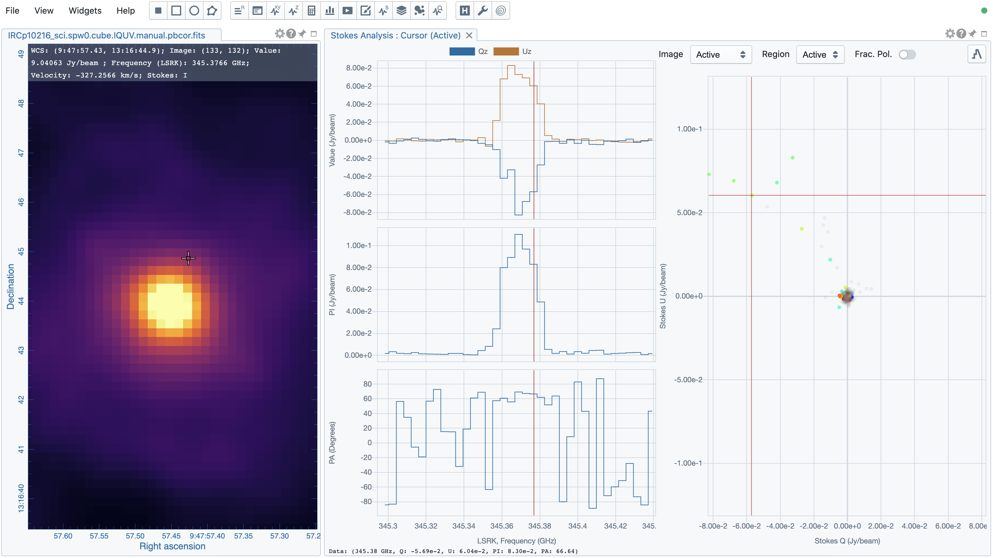
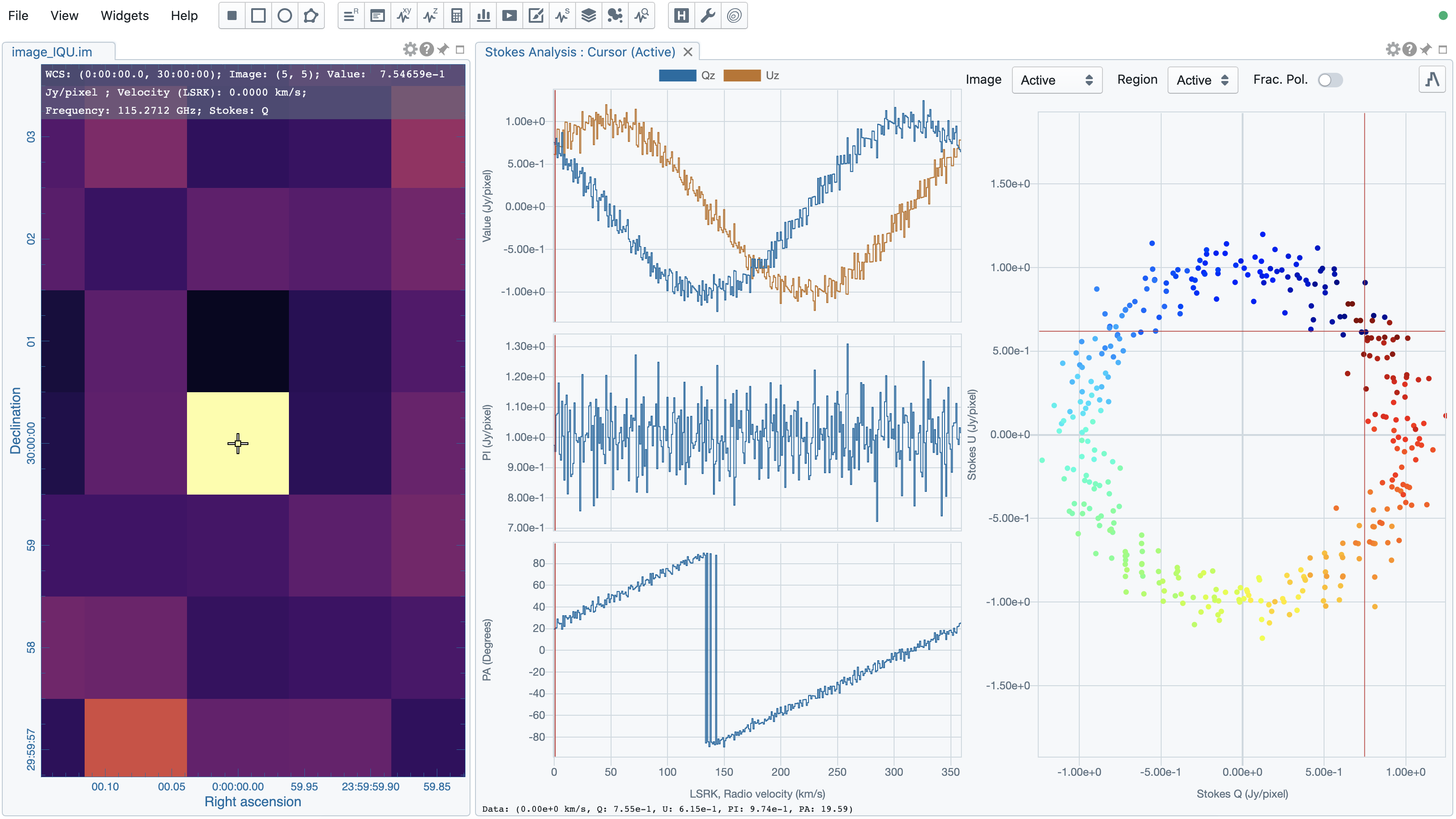
When profiles are zoomed, the scatter plot will highlight those channels just in the profile view. Similarly, when the scatter plot is zoomed, the profile plot will highlight those channels just in the scatter plot view. The profile plots and the scatter plot are inter-linked.
Additional options to customize the plots in the Stokes analysis widget are provided in the settings dialog which can be launched by clicking the “cog” button at the top-right corner. With the options in the dialog, you can configure the appearance of the profile plots and the scatter plot. Optionally, profile smoothing can be applied with the “Smoothing” tab (see section Profile smoothing). A shortcut button to the “Smoothing” tab can be found at the top-right corner of the Stokes analysis widget.
Statistics widget
The statistics widget allows you to view statistics from a selected region and a selected image with a polarization component (if it exists). The following statistic quantities are supported:
- NumPixels: number of pixels included in the statistics computation
- Sum: summation
- Mean: average
- FluxDensity: flux density (requiring beam information)
- StdDev: standard deviation
- Min: minimum
- Max: maximum
- Extrema: extrema
- RMS: root mean square
- SumSq: summation of squared pixel values
The “Region” dropdown menu and the “Image” dropdown menu can be used to select which region statistics from which image to be displayed. When the selected image has the polarization axis, you can use the “Polarization” dropdown menu to select a target polarization component to compute statistics. The default is “Active” which means the current active (selected) region and the active image in the image viewer. If no region is active, the “Active” option refers to the entire image. Multiple statistics widgets can be created to display statistics computed with a combination of “Image”, “Region”, and “Polarization” (if it is available).
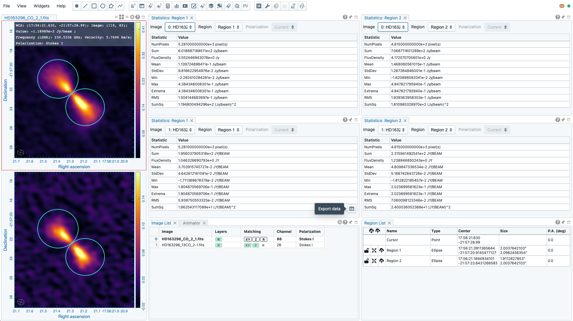
The statistics table can be exported as a text file with the “export data” button at the bottom-right corner when you hover over the widget.
Histogram widget
The histogram widget allows you to visualize image data as a histogram with respect to a selected region of a selected image. The “Image” dropdown menu and the “Region” dropdown menu can be used to select which region histogram from which image to be displayed. When the selected image has the polarization axis, you can use the “Polarization” dropdown menu to select a target polarization component to compute a histogram. The default is “Active” which means the current active (selected) region and the active image in the image viewer. If no region is active, the “Active” option refers to the entire image. Multiple histogram widgets can be created to display histograms computed with a combination of “Image”, “Region”, and “Polarization” (if it is available).
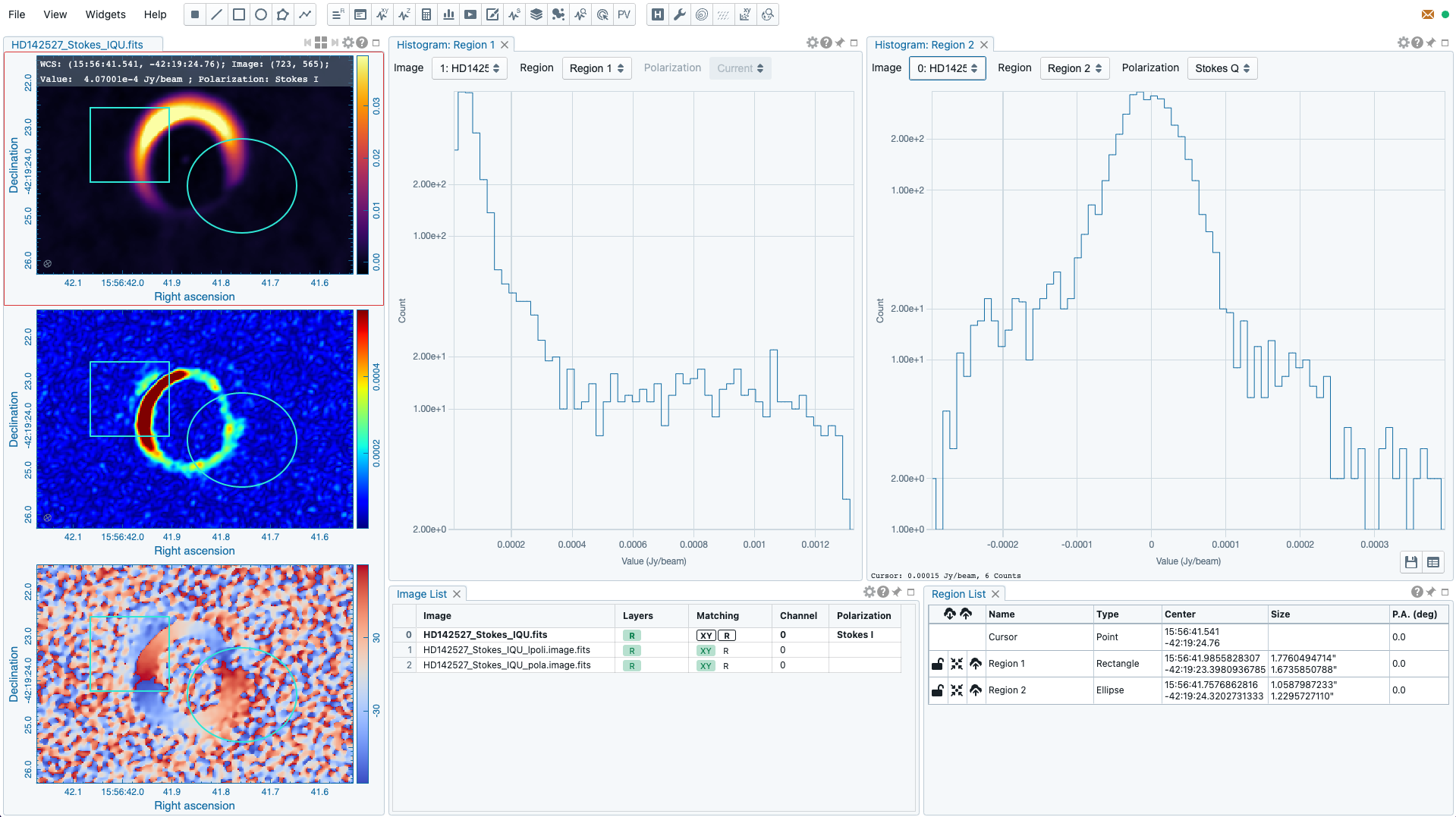
Additional options to customize the histogram plot are provided in the settings dialog which can be launched by clicking the “cog” icon at the top-right corner.
With the toolbar at the bottom-left of the histogram width, you can export the plot as a PNG file or as a TSV text file.
Note
With v3.0.0, histogram bin width and bin count are automatically decided. Enhancement of the histogram widget, including histogram fitting, will be available in a future release.
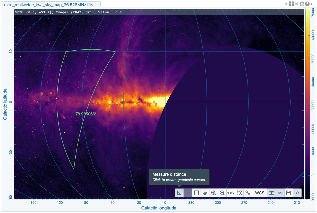
Distance measure tool
The distance measure tool is available from the toolbar of the image viewer. To measure a geodesic distance on an image, you can use two mouse clicks to define a starting point and a ending point for the distance calculations. The result is visualized on the image including the iso-longitude and iso-latitude geodesic lines. You can have new measurements with pairs of clicks. To leave the state, you can click the “pan” button of the toolbar. If a geodesic distance cannot be computed, a distance in image pixel will be reported.
Note
In a future release, a distance measure dialog will be implementd. With the dialog, you will be able to define image or world coordinates to compute a distance.
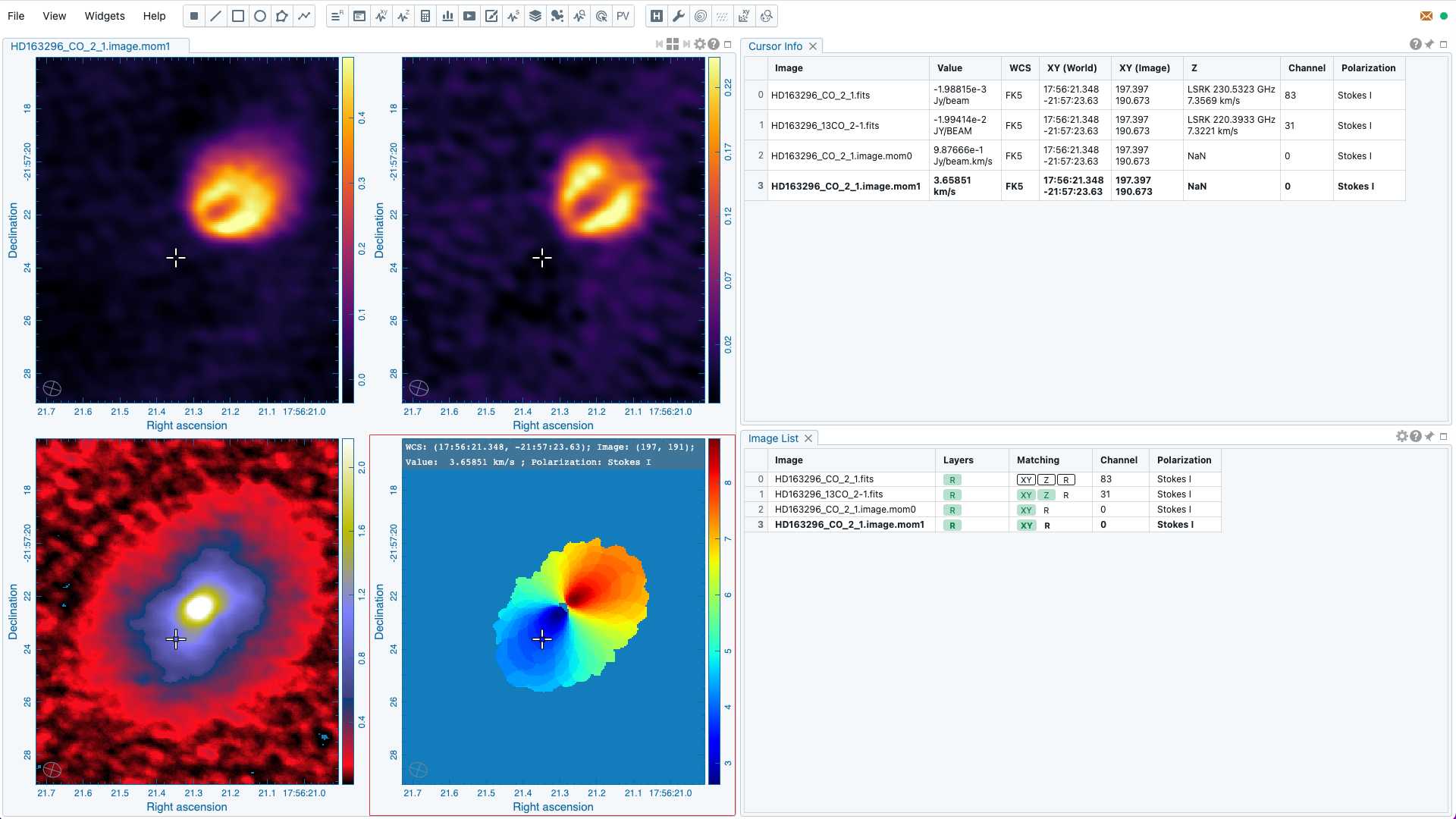
Cursor info widget
When there are multiple matched images, it is a common practice to compare pixel quantites from the images at the cursor position. The cursor info widget serves as a centralized place to show the cursor information for all the matched images in this use case. You can use the image list widget to trigger image matching. The cursor info widget includes
- image name
- pixel value
- spatial image and world coordinates
- spectral coordinate and channel index
- polarization component
Tip
In the image viewer, a cursor info bar is displayed at the top of the active image plot by default. When it is the single-panel view mode, the image in the current view is the active image. When it is the multi-panel view mode, the active image is highlighted with a red box. With the “File” -> “Preferences” -> “WCS and image overlay” -> “Cursor Info Visible” dropdown menu, you can switch to a different mode. Available modes are
- Always: always show the cursor info bar per image
- Active image only: only show the cursor info bar on the active image (default)
- Hide when tiled: do not show the cursor info bar when it is the multi-panel view mode
- Never: do not show the cursor info bar regardless it is the single-panel view mode or the multi-panel view mode
The entry for the active image is highlighted in boldface. When you see a cursor value with a “*”, the CARTA frontend is waiting for the value update from the backend. So the displayed value may not represent the pixel value at the latest cursor position. This sometimes happens with an intermittent internet condition.
Note
In a future release, a marker representing the cursor position on spatially matched image will be added to enhance the usability of the cursor info widget.
Catalog widget and online catalog query dialog
The catalog widget allows you to visualize a local or a remote source catalog in “VOTable” or “FITS” format as
- image overlay
- 2D scatter plot
- histogram
Please refer to the section Catalog visualization for details.